Plotting 1D data
ProPlot adds new features to various Axes
plotting methods using a set of “wrapper” functions. When a plotting method like
plot is “wrapped” by one of these functions, it accepts
the same parameters as the wrapper. These additions are a strict superset of
matplotlib – if you are not interested, you can use matplotlib’s plotting methods
just like you always have. This section documents the features added by wrapper
functions to 1D plotting commands like plot,
scatter, bar, and
barh.
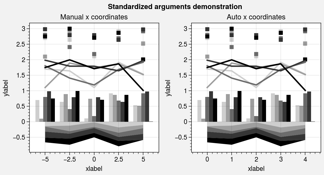
Standardized arguments
The standardize_1d wrapper standardizes
positional arguments across all 1D plotting methods.
standardize_1d lets you optionally omit the x
coordinates, in which case they are inferred from the data. It also permits
passing 2D y coordinate arrays to any plotting method, in which case the
plotting method is called for each column of the array.
[1]:
import proplot as pplt
import numpy as np

N = 5
state = np.random.RandomState(51423)
with pplt.rc.context({'axes.prop_cycle': pplt.Cycle('Grays', N=N, left=0.3)}):
    # Sample data
    x = np.linspace(-5, 5, N)
    y = state.rand(N, 5)

    # Figure
    fig, axs = pplt.subplots(ncols=2, share=False)
    axs.format(xlabel='xlabel', ylabel='ylabel')
    axs.format(suptitle='Standardized arguments demonstration')

    # Plot by passing both x and y coordinates
    ax = axs[0]
    ax.area(x, -1 * y / N, stack=True)
    ax.bar(x, y, linewidth=0, alpha=1, width=0.8)
    ax.plot(x, y + 1, linewidth=2)
    ax.scatter(x, y + 2, marker='s', markersize=5**2)
    ax.format(title='Manual x coordinates')

    # Plot by passing just y coordinates
    # Default x coordinates are inferred from DataFrame,
    # inferred from DataArray, or set to np.arange(0, y.shape[0])
    ax = axs[1]
    ax.area(-1 * y / N, stack=True)
    ax.bar(y, linewidth=0, alpha=1)
    ax.plot(y + 1, linewidth=2)
    ax.scatter(y + 2, marker='s', markersize=5**2)
    ax.format(title='Auto x coordinates')
/home/docs/checkouts/readthedocs.org/user_builds/proplot/conda/v0.7.0/lib/python3.8/site-packages/proplot/__init__.py:9: ProPlotWarning: Rebuilding font cache.
  from .config import *  # noqa: F401 F403
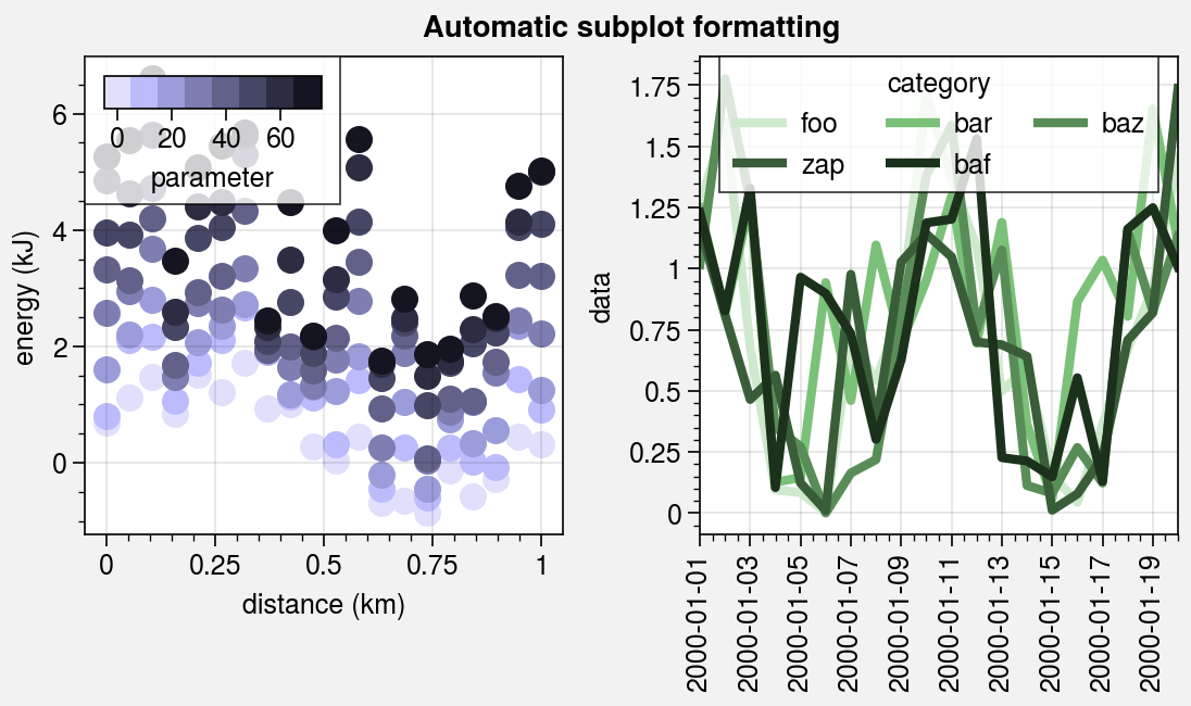
Pandas and xarray integration
The standardize_1d wrapper integrates 1D plotting
methods with pandas DataFrames and xarray DataArrays.
If you omitted x coordinates, standardize_1d tries to
retrieve them from the DataFrame or DataArray. If the coordinates are string
labels, standardize_1d converts them into indices and tick labels
using FixedLocator and IndexFormatter.
If you did not explicitly set the x-axis label, y-axis label, title, or
on-the-fly legend or colorbar label,
standardize_1d also tries to retrieve them from the DataFrame or
DataArray.
You can also pass a Dataset, DataFrame, or dictionary to any plotting
command using the data keyword, then pass dataset keys as positional
arguments instead of arrays. For example, ax.plot('y', data=dataset)
is translated to ax.plot(dataset['y']), and the x coordinates are
inferred thereafter.
These features restore some of the convenience you get
with the builtin pandas and xarray plotting functions. They are also
optional – installation of pandas and xarray are not required. All of
these features can be disabled by setting rc.autoformat to False
or by passing autoformat=False to any plotting command.
[2]:
import xarray as xr
import numpy as np
import pandas as pd

# DataArray
state = np.random.RandomState(51423)
data = (
    np.sin(np.linspace(0, 2 * np.pi, 20))[:, None]
    + state.rand(20, 8).cumsum(axis=1)
)
coords = {
    'x': xr.DataArray(
        np.linspace(0, 1, 20),
        dims=('x',),
        attrs={'long_name': 'distance', 'units': 'km'}
    ),
    'num': xr.DataArray(
        np.arange(0, 80, 10),
        dims=('num',),
        attrs={'long_name': 'parameter'}
    )
}
da = xr.DataArray(
    data, dims=('x', 'num'), coords=coords, name='energy', attrs={'units': 'kJ'}
)

# DataFrame
data = (
    (np.cos(np.linspace(0, 2 * np.pi, 20))**4)[:, None] + state.rand(20, 5)**2
)
ts = pd.date_range('1/1/2000', periods=20)
df = pd.DataFrame(data, index=ts, columns=['foo', 'bar', 'baz', 'zap', 'baf'])
df.name = 'data'
df.index.name = 'date'
df.columns.name = 'category'
[3]:
import proplot as pplt
fig, axs = pplt.subplots(ncols=2, refwidth=2.2, share=0)
axs.format(suptitle='Automatic subplot formatting')

# Plot DataArray
cycle = pplt.Cycle('dark blue', space='hpl', N=da.shape[1])
axs[0].scatter(da, cycle=cycle, lw=3, colorbar='ul', colorbar_kw={'locator': 20})

# Plot Dataframe
cycle = pplt.Cycle('dark green', space='hpl', N=df.shape[1])
axs[1].plot(df, cycle=cycle, lw=3, legend='uc')
[3]:
[<matplotlib.lines.Line2D at 0x7f3b2174d9a0>,
 <matplotlib.lines.Line2D at 0x7f3b2174da90>,
 <matplotlib.lines.Line2D at 0x7f3b216d40a0>,
 <matplotlib.lines.Line2D at 0x7f3b216d4400>,
 <matplotlib.lines.Line2D at 0x7f3b2174a850>]
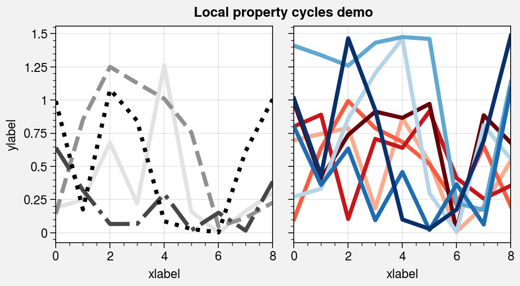
Property cycles
It is often useful to create on-the-fly property cycles
and use different property cycles for different plot elements. You can create and
apply property cycles on-the-fly using the cycle and cycle_kw arguments, available
with any plotting method wrapped by apply_cycle. cycle and
cycle_kw are passed to the Cycle
constructor function, and the resulting property cycle
is used for the plot. You can specify cycle once with 2D input data (in which case
each column is plotted in succession according to the property cycle) or call a
plotting command multiple times with the same cycle argument each time (the
property cycle is not reset). For more information on property cycles, see the
color cycles section and this matplotlib tutorial.
[4]:
import proplot as pplt
import numpy as np

# Sample data
M, N = 9, 4
state = np.random.RandomState(51423)
data1 = state.rand(M, N)
data2 = state.rand(M, N) * 1.5

with pplt.rc.context({'lines.linewidth': 3}):
    # Figure
    fig, axs = pplt.subplots(ncols=2, refwidth=2.2, span=False)
    axs.format(xlabel='xlabel', ylabel='ylabel', suptitle='Local property cycles demo')

    # Use property cycle for columns of 2D input data
    axs[0].plot(
        data1 * data2,
        cycle='black',
        cycle_kw={'ls': ('-', '--', '-.', ':')}
    )

    # Use property cycle with successive plot() calls
    for i in range(data1.shape[1]):
        axs[1].plot(data1[:, i], cycle='Reds', cycle_kw={'N': N, 'left': 0.3})
    for i in range(data1.shape[1]):
        axs[1].plot(data2[:, i], cycle='Blues', cycle_kw={'N': N, 'left': 0.3})
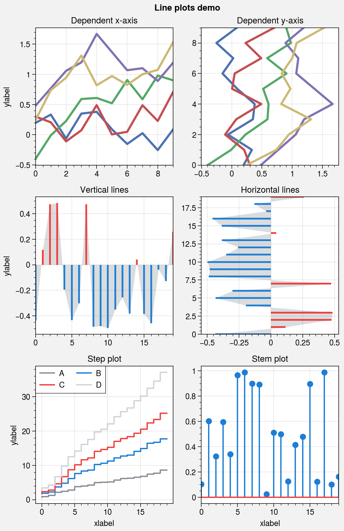
Line plots
The plot command is wrapped by
apply_cycle and standardize_1d.
The new plotx command can be used
just like plot, except a single argument is interpreted
as x coordinates (with y coordinates inferred from the data),
and multiple arguments are interpreted as (y, x) pairs. This is
analogous to barh and fill_betweenx.
Also, the x extent of lines drawn with plot and
the y extent of lines drawn with plotx are now
“sticky”, i.e. there is no padding between the lines and axes edges by default.
As with the other 1D plotting commands, step,
hlines, vlines, and
stem are wrapped by standardize_1d.
step now use the property cycle, just like
plot. vlines and
hlines are also wrapped by vlines_extras
and hlines_extras, which permit applying
different colors for “negative” and “positive” lines using negpos=True
(the default colors are rc.negcolor = 'blue7' and rc.poscolor = 'red7').
[5]:
import proplot as pplt
import numpy as np
state = np.random.RandomState(51423)
fig, axs = pplt.subplots(ncols=2, nrows=3, refwidth=2.2, share=1, span=False)
axs.format(suptitle='Line plots demo', xlabel='xlabel', ylabel='ylabel')

# Vertical vs. horizontal
data = (state.rand(10, 5) - 0.5).cumsum(axis=0)
ax = axs[0]
ax.format(title='Dependent x-axis')
ax.plot(data, lw=2.5, cycle='seaborn')
ax = axs[1]
ax.format(title='Dependent y-axis')
ax.plotx(data, lw=2.5, cycle='seaborn')

# Vertical lines
gray = 'gray7'
data = state.rand(20) - 0.5
ax = axs[2]
ax.area(data, color=gray, alpha=0.2)
ax.vlines(data, negpos=True, lw=2)
ax.format(title='Vertical lines')

# Horizontal lines
ax = axs[3]
ax.areax(data, color=gray, alpha=0.2)
ax.hlines(data, negpos=True, lw=2)
ax.format(title='Horizontal lines')

# Step
ax = axs[4]
data = state.rand(20, 4).cumsum(axis=1).cumsum(axis=0)
cycle = ('gray6', 'blue7', 'red7', 'gray4')
ax.step(data, cycle=cycle, labels=list('ABCD'), legend='ul', legend_kw={'ncol': 2})
ax.format(title='Step plot')

# Stems
ax = axs[5]
data = state.rand(20)
ax.stem(data)
ax.format(title='Stem plot')
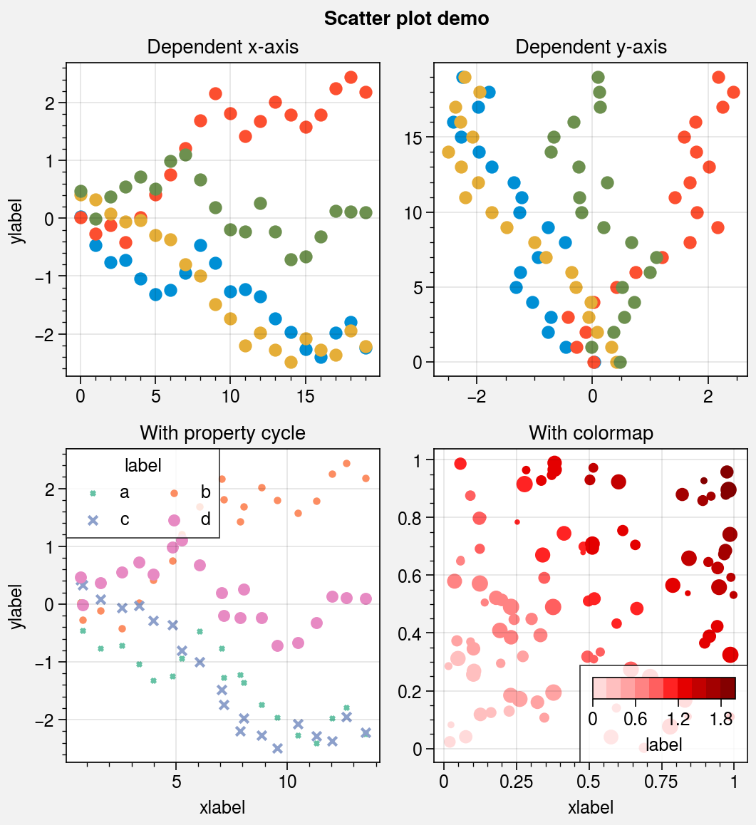
Scatter plots
The scatter command is wrapped by
scatter_extras, apply_cycle, and
standardize_1d. This means that
scatter now permits omitting x coordinates
and accepts 2D y coordinates, just like plot.
As with plotx, the new scatterx
command is used just like scatter, except a
single argument is interpreted as x coordinates (with default y
coordinates inferred from the data), and multiple arguments are interpreted
as (y, x) pairs. scatter also now accepts keywords
that look like plot keywords (e.g., color instead of c and
markersize instead of s). This way, scatter can
be used simply to “plot markers, not lines” without changing the
input arguments relative to plot.
scatter now uses the property cycler by default, just like
plot. It can be changed using the cycle keyword argument,
and it can include properties like marker and markersize. The colormap cmap
and normalizer norm used with the optional c color array are now passed through
the Colormap and Norm constructor
functions, and the the s marker size array can now be conveniently scaled using
the keywords smin and smax (analogous to vmin and vmax used for colors).
[6]:
import proplot as pplt
import numpy as np
import pandas as pd

# Sample data
state = np.random.RandomState(51423)
x = (state.rand(20) - 0).cumsum()
data = (state.rand(20, 4) - 0.5).cumsum(axis=0)
data = pd.DataFrame(data, columns=pd.Index(['a', 'b', 'c', 'd'], name='label'))

# Figure
fig, axs = pplt.subplots(ncols=2, nrows=2, refwidth=2.2, share=1, span=False)
axs.format(suptitle='Scatter plot demo')

# Vertical vs. horizontal
ax = axs[0]
ax.set_title('Dependent x-axis')
ax.scatter(data, cycle='538')
ax = axs[1]
ax.set_title('Dependent y-axis')
ax.scatterx(data, cycle='538')

# Scatter plot with property cycler
ax = axs[2]
ax.set_title('With property cycle')
obj = ax.scatter(
    x, data, legend='ul', legend_kw={'ncols': 2},
    cycle='Set2', cycle_kw={'m': ['x', 'o', 'x', 'o'], 'ms': [5, 10, 20, 30]}
)

# Scatter plot with colormap
ax = axs[3]
ax.set_title('With colormap')
data = state.rand(2, 100)
obj = ax.scatter(
    *data,
    s=state.rand(100), smin=3, smax=60, marker='o',
    c=data.sum(axis=0), cmap='dark red',
    colorbar='lr', colorbar_kw={'label': 'label'},
)
axs.format(xlabel='xlabel', ylabel='ylabel')
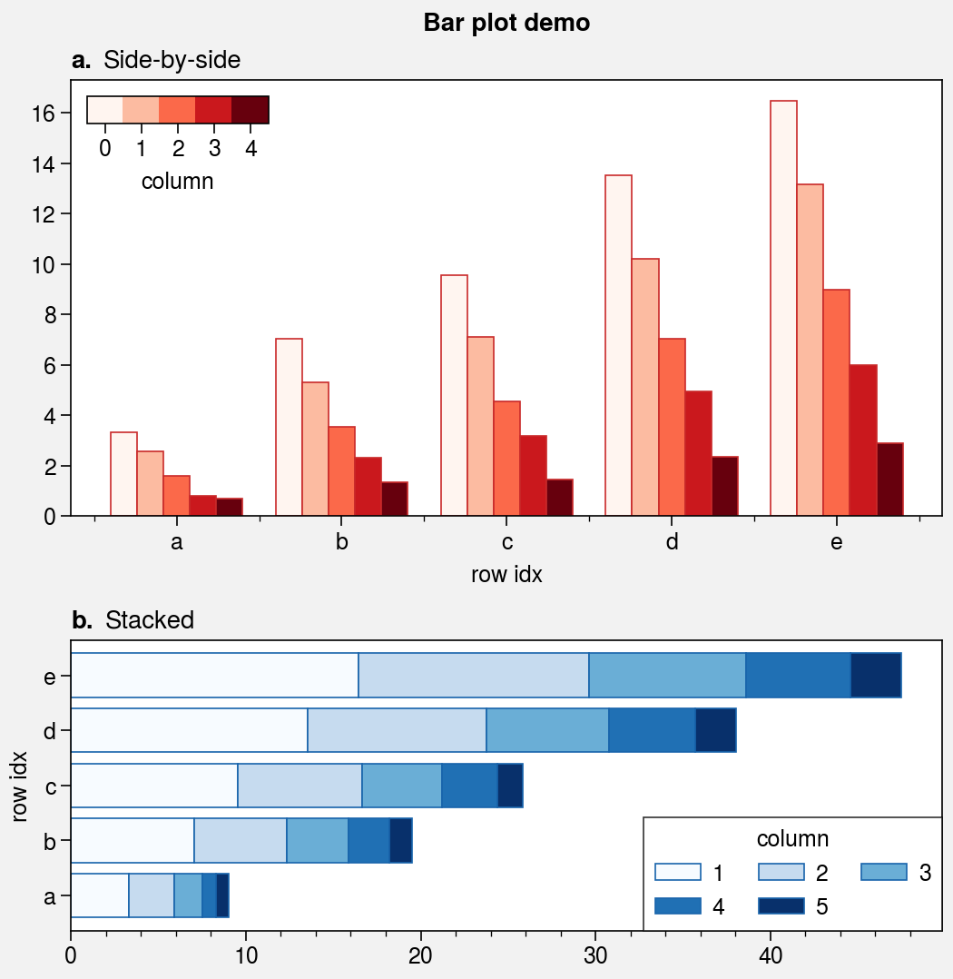
Bar plots and area plots
The bar and barh methods
are wrapped by bar_extras,
apply_cycle, and standardize_1d.
This means that bar and barh employ
default x or y coordinates if you failed to provide them explicitly.
You can now group or stack columns of data by passing 2D arrays to
bar or barh, just like in
pandas. You can also use different colors for “negative” and “positive”
bars by passing negpos=True (the default colors are rc.negcolor = 'blue7'
and rc.poscolor = 'red7').
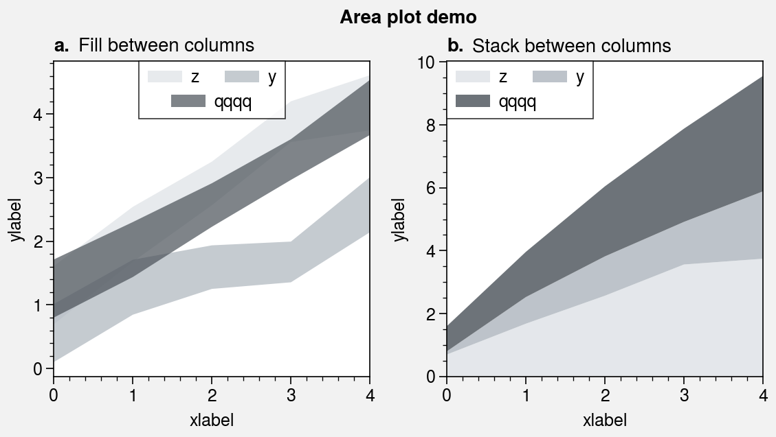
The fill_between and fill_betweenx
commands are wrapped by fill_between_extras and
fill_betweenx_extras. They also have the optional shorthands
area and areax. You can now stack
or overlay columns of data by passing 2D arrays to to these commands, just like in
pandas. You can also draw area plots that change color when the fill boundaries
cross each other by passing negpos=True (the default colors are rc.negcolor = 'blue7'
and rc.poscolor = 'red7'). The most common use case for this is highlighting negative
and positive areas with different colors. Also, the x extent of shading drawn
with fill_between and the y extent of shading drawn with
fill_betweenx is now “sticky”, i.e. there is no padding between
the shading and axes edges by default.
[7]:
import proplot as pplt
import numpy as np
import pandas as pd

# Sample data
state = np.random.RandomState(51423)
data = state.rand(5, 5).cumsum(axis=0).cumsum(axis=1)[:, ::-1]
data = pd.DataFrame(
    data, columns=pd.Index(np.arange(1, 6), name='column'),
    index=pd.Index(['a', 'b', 'c', 'd', 'e'], name='row idx')
)

# Figure
pplt.rc.abc = True
pplt.rc.titleloc = 'l'
pplt.rc.abcstyle = 'a.'
fig, axs = pplt.subplots(nrows=2, refaspect=2, refwidth=4.8, share=0, hratios=(3, 2))

# Side-by-side bars
ax = axs[0]
obj = ax.bar(
    data, cycle='Reds', edgecolor='red9',
    colorbar='ul', colorbar_kw={'frameon': False}
)
ax.format(
    xlocator=1, xminorlocator=0.5, ytickminor=False,
    title='Side-by-side', suptitle='Bar plot demo'
)

# Stacked bars
ax = axs[1]
obj = ax.barh(
    data.iloc[::-1, :], cycle='Blues', edgecolor='blue9',
    legend='lr', stack=True,
)
ax.format(title='Stacked')
axs.format(grid=False)
[8]:
import proplot as pplt
import numpy as np

# Sample data
state = np.random.RandomState(51423)
data = state.rand(5, 3).cumsum(axis=0)
cycle = ('gray3', 'gray5', 'gray7')

# Figure
fig, axs = pplt.subplots(ncols=2, refwidth=2.3, share=0)
axs.format(grid=False, xlabel='xlabel', ylabel='ylabel', suptitle='Area plot demo')

# Overlaid area patches
ax = axs[0]
ax.area(
    np.arange(5), data, data + state.rand(5)[:, None], cycle=cycle, alpha=0.7,
    legend='uc', legend_kw={'center': True, 'ncols': 2, 'labels': ['z', 'y', 'qqqq']},
)
ax.format(title='Fill between columns')

# Stacked area patches
ax = axs[1]
ax.area(
    np.arange(5), data, stack=True, cycle=cycle, alpha=0.8,
    legend='ul', legend_kw={'center': True, 'ncols': 2, 'labels': ['z', 'y', 'qqqq']},
)
ax.format(title='Stack between columns')
[9]:
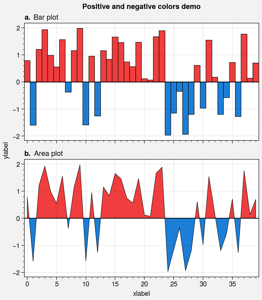
import proplot as pplt
import numpy as np

# Sample data
state = np.random.RandomState(51423)
data = 4 * (state.rand(40) - 0.5)

# Figure
fig, axs = pplt.subplots(nrows=2, refaspect=2, figwidth=5)
axs.format(
    xmargin=0, xlabel='xlabel', ylabel='ylabel', grid=True,
    suptitle='Positive and negative colors demo',
)
axs.axhline(0, color='k', linewidth=1)  # zero line

# Bar plot
axs[0].bar(data, width=1, negpos=True)
axs[0].format(title='Bar plot')

# Area plot
axs[1].area(data, negpos=True, lw=0.5, edgecolor='k')
axs[1].format(title='Area plot')

# Reset title styles changed above
pplt.rc.reset()
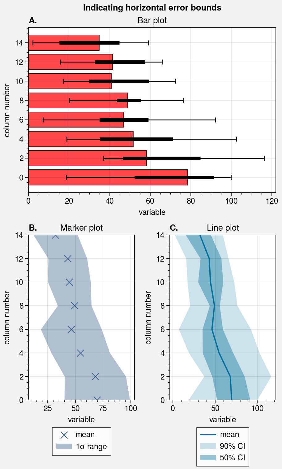
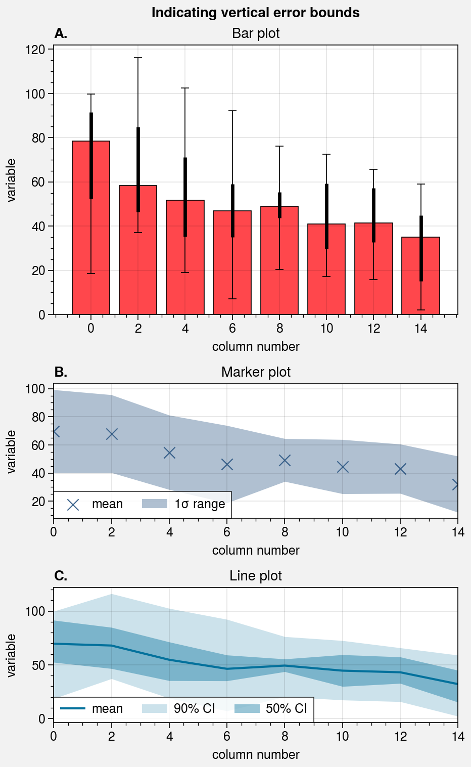
Shading and error bars
The indicate_error wrapper lets you draw error bars
and error shading on-the-fly by passing certain keyword arguments to
plot, scatter,
bar, plot,
scatterx, or barh.
If you pass 2D arrays to these methods with mean=True or median=True,
the means or medians of each column are drawn as points, lines, or bars, and
error bars or shading is drawn to represent the spread of the distribution
for each column. You can also specify the error bounds manually with the
bardata, boxdata, shadedata, and fadedata keywords.
indicate_error can draw thin error bars with optional whiskers,
thick “boxes” overlayed on top of these bars (think of these as miniature boxplots),
and up to 2 layers of shading. See indicate_error for details.
[10]:
import numpy as np
import pandas as pd

# Sample data
# Each column represents a distribution
state = np.random.RandomState(51423)
data = state.rand(20, 8).cumsum(axis=0).cumsum(axis=1)[:, ::-1]
data = data + 20 * state.normal(size=(20, 8)) + 30
data = pd.DataFrame(data, columns=np.arange(0, 16, 2))
data.columns.name = 'column number'
data.name = 'variable'

# Calculate error data
# Passed to 'errdata' in the 3rd subplot example
means = data.mean(axis=0)
means.name = data.name  # copy name for formatting
fadedata = np.percentile(data, (5, 95), axis=0)  # light shading
shadedata = np.percentile(data, (25, 75), axis=0)  # dark shading
[11]:
import proplot as pplt
import numpy as np

# Loop through "vertical" and "horizontal" versions
varray = [[1], [2], [3]]
harray = [[1, 1], [2, 3], [2, 3]]
for orientation, array in zip(('horizontal', 'vertical'), (harray, varray)):
    # Figure
    fig, axs = pplt.subplots(
        array, refaspect=1.5, refwidth=4,
        share=0, hratios=(2, 1, 1)
    )
    axs.format(
        abc=True, abcstyle='A.', suptitle=f'Indicating {orientation} error bounds'
    )

    # Medians and percentile ranges
    ax = axs[0]
    kw = dict(
        color='light red', legend=True,
        median=True, barpctile=90, boxpctile=True,
        # median=True, barpctile=(5, 95), boxpctile=(25, 75)  # equivalent
    )
    if orientation == 'horizontal':
        ax.barh(data, **kw)
    else:
        ax.bar(data, **kw)
    ax.set_title('Bar plot')

    # Means and standard deviation range
    ax = axs[1]
    kw = dict(
        color='denim', marker='x', markersize=8**2, linewidth=0.8,
        label='mean', shadelabel=True,
        mean=True, shadestd=1,
        # mean=True, shadestd=(-1, 1)  # equivalent
    )
    if orientation == 'horizontal':
        ax.scatterx(data, legend='b', legend_kw={'ncol': 1}, **kw)
    else:
        ax.scatter(data, legend='ll', **kw)
    ax.set_title('Marker plot')

    # User-defined error bars
    ax = axs[2]
    kw = dict(
        shadedata=shadedata, fadedata=fadedata,
        label='mean', shadelabel='50% CI', fadelabel='90% CI',
        color='ocean blue', barzorder=0, boxmarker=False,
    )
    if orientation == 'horizontal':
        ax.plotx(means, legend='b', legend_kw={'ncol': 1}, **kw)
    else:
        ax.plot(means, legend='ll', **kw)
    ax.set_title('Line plot')
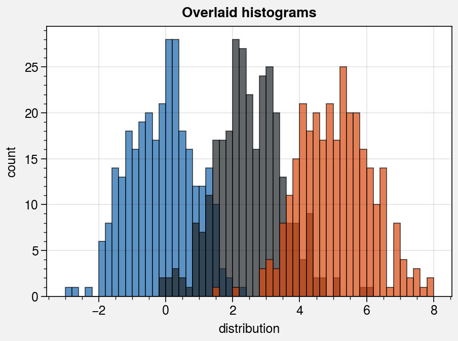
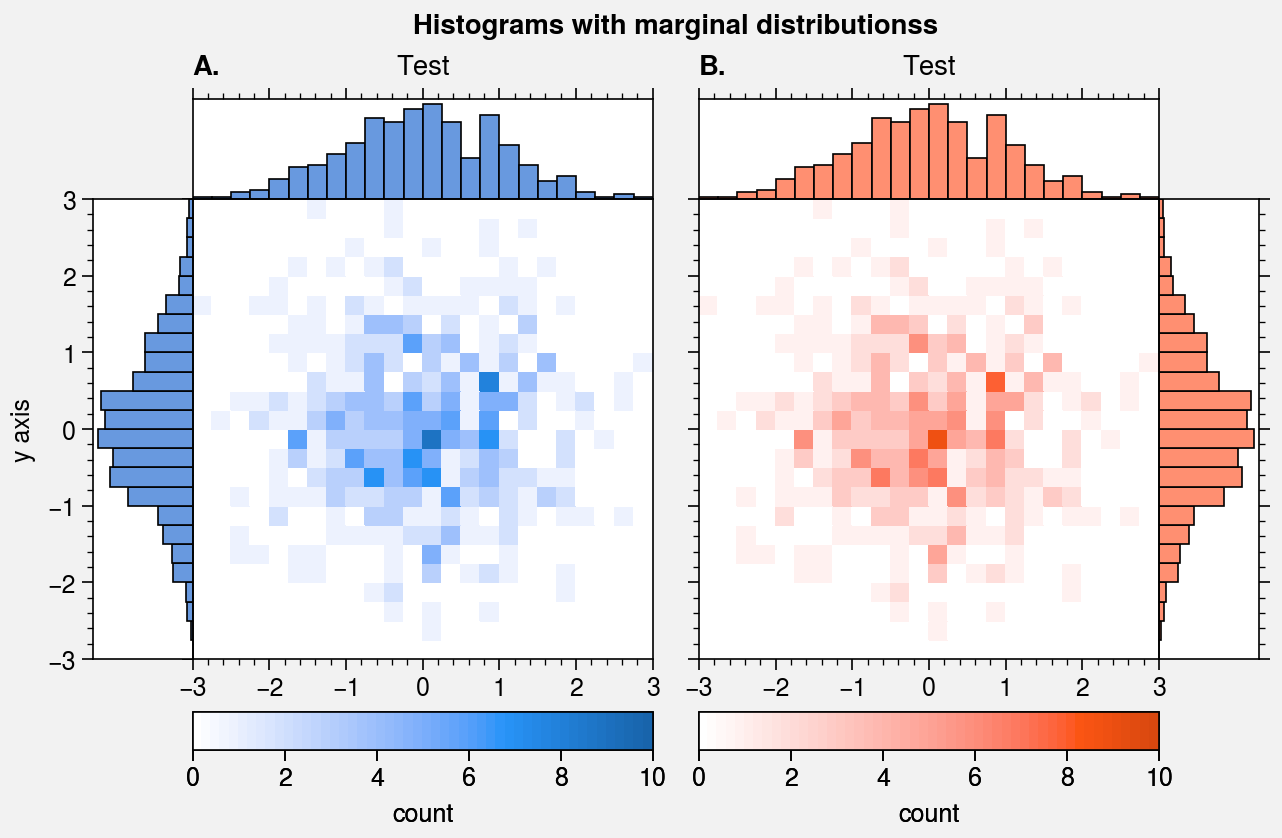
Histogram plots
ProPlot wraps the hist command with
standardize_1d and apply_cycle
(see the 1d plotting section).
It also wraps the hist2d and
hexbin commands with
standardize_2d and apply_cmap.
In the future, ProPlot may introduce a kdeplot command analogous to
seaborn.kdeplot for drawing “smooth” histograms with optional
panels showing the marginal distributions. For now, marginal distributions
for hist2d plots can be easily plotted
using panel axes.
[12]:
import proplot as pplt
import numpy as np

# Sample data
M, N = 300, 3
state = np.random.RandomState(51423)
x = state.normal(size=(M, N)) + state.rand(M)[:, None] * np.arange(N) + 2 * np.arange(N)

# Sample overlayed histograms
fig, ax = pplt.subplots(refwidth=4, refaspect=(3, 2))
ax.format(suptitle='Overlaid histograms', xlabel='distribution', ylabel='count')
ax.hist(
    x, pplt.arange(-3, 8, 0.2), alpha=0.7,
    cycle=('blue9', 'gray9', 'orange9'), labels=list('abc'), legend='ul',
)

# Sample data
N = 500
x = state.normal(size=(N,))
y = state.normal(size=(N,))
bins = pplt.arange(-3, 3, 0.25)

# Histogram with marginal distributions
fig, axs = pplt.subplots(ncols=2, refwidth=2.3)
axs.format(
    abc=True, abcstyle='A.', titleabove=True, title='Test',
    ylabel='y axis', suptitle='Histograms with marginal distributionss'
)
for ax, which, color in zip(axs, 'lr', ('blue9', 'orange9')):
    ax.hist2d(
        x, y, bins, vmin=0, vmax=10, levels=50,
        cmap=color, colorbar='b', colorbar_kw={'label': 'count'}
    )
    color = pplt.scale_luminance(color, 1.5)  # histogram colors
    side = ax.panel(which, space=0)
    side.hist(y, bins, color=color, vert=False)  # or orientation='horizontal'
    side.format(grid=False, xlocator=[], xreverse=(which == 'l'))
    top = ax.panel('t', space=0)
    top.hist(x, bins, color=color)
    top.format(grid=False, ylocator=[])
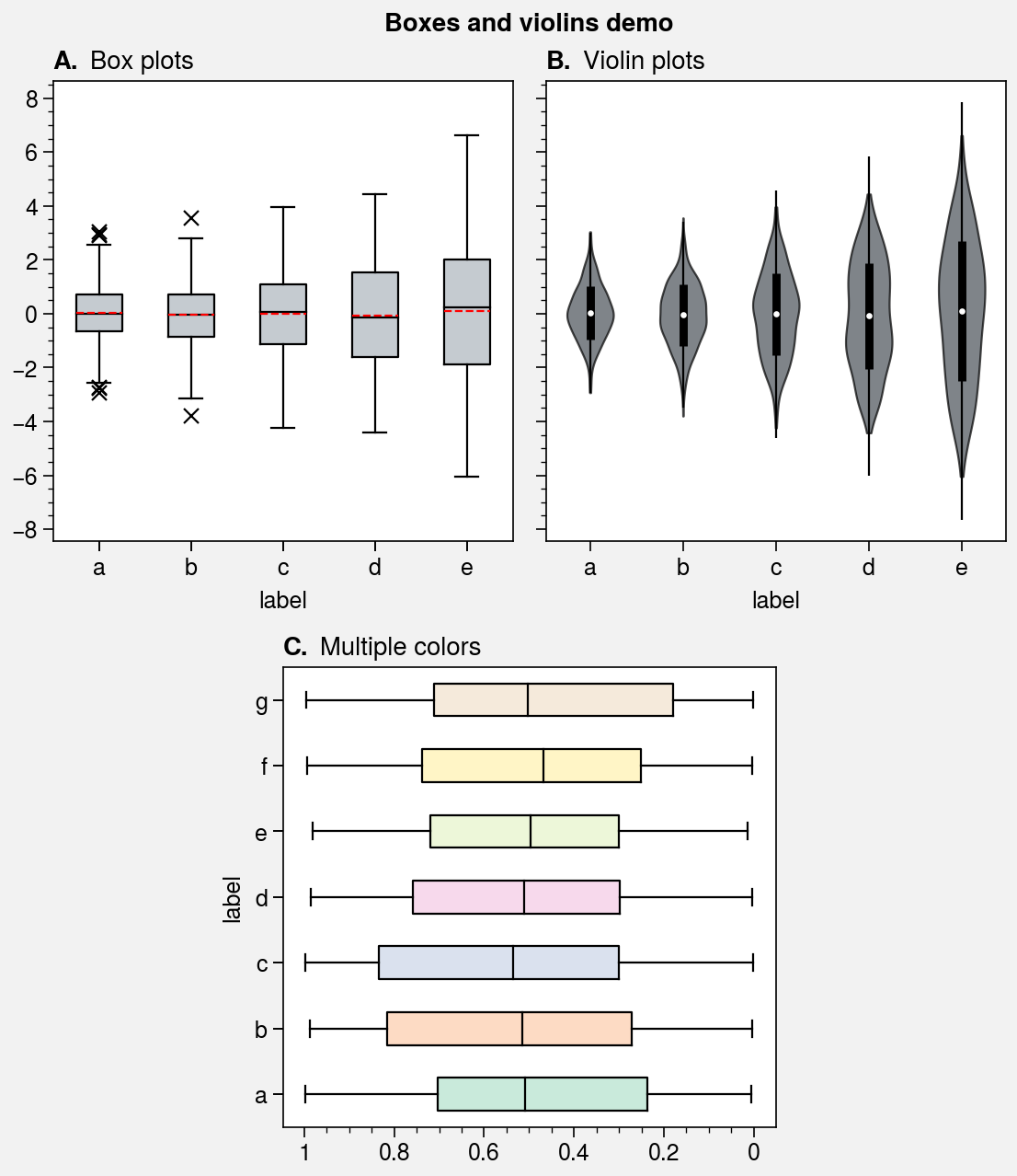
Box plots and violin plots
The boxplot and violinplot
commands are wrapped by boxplot_extras,
violinplot_extras, apply_cycle,
and standardize_1d. They also now have the optional shorthands
boxes and violins. The wrappers
apply aesthetically pleasing default settings and permit configuration using
keyword arguments like color, boxcolor, and fillcolor. They also
automatically apply axis labels based on the DataFrame or
DataArray column labels or the input x coordinate labels.
[13]:
import proplot as pplt
import numpy as np
import pandas as pd

# Sample data
N = 500
state = np.random.RandomState(51423)
data1 = state.normal(size=(N, 5)) + 2 * (state.rand(N, 5) - 0.5) * np.arange(5)
data1 = pd.DataFrame(data1, columns=pd.Index(list('abcde'), name='label'))
data2 = state.rand(100, 7)
data2 = pd.DataFrame(data2, columns=pd.Index(list('abcdefg'), name='label'))

# Figure
fig, axs = pplt.subplots([[1, 1, 2, 2], [0, 3, 3, 0]], span=False)
axs.format(
    titleloc='l', abc=True, abcstyle='A.', grid=False,
    suptitle='Boxes and violins demo')

# Box plots
ax = axs[0]
obj1 = ax.boxplot(
    data1, means=True, meancolor='red', marker='x', fillcolor='gray5',
)
ax.format(title='Box plots')

# Violin plots
ax = axs[1]
obj2 = ax.violinplot(
    data1, fillcolor='gray7', means=True, points=100,
)
ax.format(title='Violin plots')

# Boxes with different colors
ax = axs[2]
colors = pplt.Colors('pastel2')  # list of colors from the cycle
ax.boxplot(data2, fillcolor=colors, orientation='horizontal')
ax.format(title='Multiple colors', ymargin=0.15)
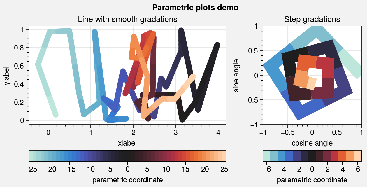
Parametric plots
To make “parametric” plots, use the new parametric
command. Parametric plots are LineCollections that
map individual line segments to individual colors, where each segment represents a
“parametric” coordinate (e.g., time). The parametric coordinates are specified with
the values keyword argument. See parametric for details. As
shown below, it is also easy to build colorbars from the
LineCollection returned by parametric.
[14]:
import proplot as pplt
import numpy as np
import pandas as pd
fig, axs = pplt.subplots(
    share=0, ncols=2, wratios=(2, 1),
    figwidth='16cm', refaspect=(2, 1)
)
axs.format(suptitle='Parametric plots demo')
cmap = 'IceFire'

# Sample data
state = np.random.RandomState(51423)
N = 50
x = (state.rand(N) - 0.52).cumsum()
y = state.rand(N)
c = np.linspace(-N / 2, N / 2, N)  # color values
c = pd.Series(c, name='parametric coordinate')

# Parametric line with smooth gradations
ax = axs[0]
m = ax.parametric(
    x, y, c, interp=5, capstyle='round', joinstyle='round',
    lw=7, cmap=cmap, colorbar='b', colorbar_kw={'locator': 5}
)
ax.format(xlabel='xlabel', ylabel='ylabel', title='Line with smooth gradations')

# Sample data
N = 12
radii = np.linspace(1, 0.2, N + 1)
angles = np.linspace(0, 4 * np.pi, N + 1)
x = radii * np.cos(1.4 * angles)
y = radii * np.sin(1.4 * angles)
c = np.linspace(-N / 2, N / 2, N + 1)

# Parametric line with stepped gradations
ax = axs[1]
m = ax.parametric(x, y, c, cmap=cmap, lw=15)
ax.format(
    xlim=(-1, 1), ylim=(-1, 1), title='Step gradations',
    xlabel='cosine angle', ylabel='sine angle'
)
ax.colorbar(m, loc='b', maxn=10, label='parametric coordinate')
[14]:
<matplotlib.colorbar.Colorbar at 0x7f3b1fc0b5b0>