Cartesian plots
This section documents features used for modifying Cartesian x and y axis settings, including axis scales, tick locations, and tick label formatting. It also documents a handy “dual axes” feature.
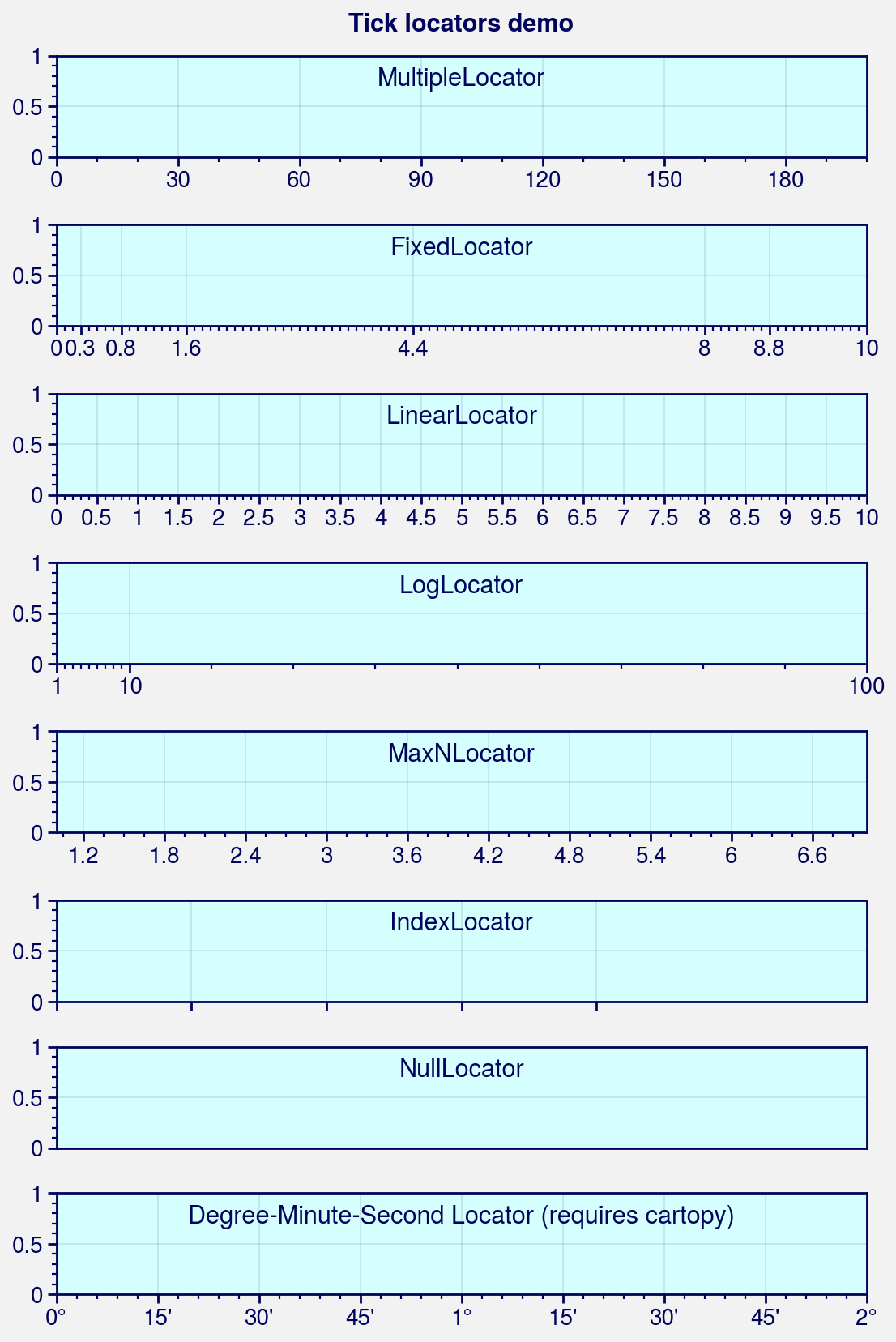
Tick locations
Tick locators
are used to automatically select sensible tick locations
based on the axis data limits. In ProPlot, you can change the tick locator
using the format keyword arguments xlocator,
ylocator, xminorlocator, and yminorlocator (or their aliases,
xticks, yticks, xminorticks, and yminorticks). This is powered by
the Locator constructor function.
These keyword arguments can be used to apply built-in matplotlib
Locators by their “registered” names (e.g.
xlocator='log'), to draw ticks every N data values with
MultipleLocator (e.g., xlocator=2), or to tick the
specific locations in a list using FixedLocator (just
like set_xticks and
set_yticks). See
format and Locator for
details.
To generate lists of tick locations, we recommend using ProPlot’s
arange function – it’s basically an endpoint-inclusive
version of numpy.arange, which is usually what you’ll want in this
context.
[1]:
import proplot as pplt
import numpy as np
state = np.random.RandomState(51423)
pplt.rc.update(
    facecolor=pplt.scale_luminance('powderblue', 1.15),
    linewidth=1, fontsize=10,
    color='dark blue', suptitlecolor='dark blue',
    titleloc='upper center', titlecolor='dark blue', titleborder=False,
)
fig, axs = pplt.subplots(nrows=8, refwidth=5, refaspect=(8, 1), share=0)
axs.format(suptitle='Tick locators demo')

# Step size for tick locations
axs[0].format(
    xlim=(0, 200), xminorlocator=10, xlocator=30,
    title='MultipleLocator'
)

# Specific list of locations
axs[1].format(
    xlim=(0, 10), xminorlocator=0.1,
    xlocator=[0, 0.3, 0.8, 1.6, 4.4, 8, 8.8, 10],
    title='FixedLocator',
)

# Ticks at numpy.linspace(xmin, xmax, N)
axs[2].format(
    xlim=(0, 10), xlocator=('linear', 21),
    title='LinearLocator',
)

# Logarithmic locator, used automatically for log scale plots
axs[3].format(
    xlim=(1, 100), xlocator='log', xminorlocator='logminor',
    title='LogLocator',
)

# Maximum number of ticks, but at "nice" locations
axs[4].format(
    xlim=(1, 7), xlocator=('maxn', 11),
    title='MaxNLocator',
)

# Index locator, only draws ticks where data is plotted
axs[5].plot(np.arange(10) - 5, state.rand(10), alpha=0)
axs[5].format(
    xlim=(0, 6), ylim=(0, 1), xlocator='index',
    xformatter=[r'$\alpha$', r'$\beta$', r'$\gamma$', r'$\delta$', r'$\epsilon$'],
    title='IndexLocator',
)
pplt.rc.reset()

# Hide all ticks
axs[6].format(
    xlim=(-10, 10), xlocator='null',
    title='NullLocator',
)

# Tick locations that cleanly divide 60 minute/60 second intervals
axs[7].format(
    xlim=(0, 2), xlocator='dms', xformatter='dms',
    title='Degree-Minute-Second Locator (requires cartopy)',
)
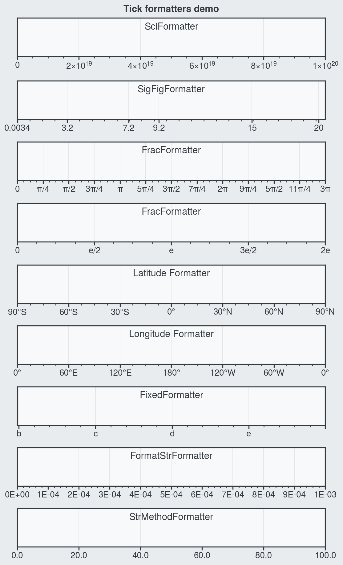
Tick labels
Tick formatters
are used to convert floating point numbers to
nicely-formatted tick labels. In ProPlot, you can change the tick formatter
using the format keyword arguments xformatter and
yformatter (or their aliases, xticklabels and yticklabels). This is
powered by the Formatter
constructor function.
These keyword arguments can be used to apply built-in matplotlib
Formatters by their “registered” names (e.g.
xformatter='log'), to apply a %-style format directive with
FormatStrFormatter (e.g., xformatter='%.0f'), or
to apply custom tick labels with FixedFormatter (just
like set_xticklabels and
set_yticklabels). They can also be used
to apply one of ProPlot’s new tick formatters – for example,
xformatter='deglat' to label ticks as the geographic latitude,
xformatter='pi' to label ticks as fractions of \(\pi\),
or xformatter='sci' to label ticks with scientific notation.
See format and
Formatter for details.
ProPlot also changes the default tick formatter to
AutoFormatter. This class trims trailing zeros by
default, can be used to omit tick labels outside of some data range, and
can add arbitrary prefixes and suffixes to each label. See
AutoFormatter for details. To disable the trailing
zero-trimming feature, set rc[‘formatter.zerotrim’] to False.
[2]:
import proplot as pplt
import numpy as np
pplt.rc.update(
    linewidth=1.2, fontsize=10, facecolor='gray0', figurefacecolor='gray2',
    color='gray8', gridcolor='gray8', titlecolor='gray8', suptitlecolor='gray8',
    titleloc='upper center', titleborder=False,
)
fig, axs = pplt.subplots(nrows=9, refwidth=5, refaspect=(8, 1), share=0)

# Scientific notation
axs[0].format(xlim=(0, 1e20), xformatter='sci', title='SciFormatter')

# N significant figures for ticks at specific values
axs[1].format(
    xlim=(0, 20), xlocator=(0.0034, 3.233, 9.2, 15.2344, 7.2343, 19.58),
    xformatter=('sigfig', 2), title='SigFigFormatter',  # 2 significant digits
)

# Fraction formatters
axs[2].format(
    xlim=(0, 3 * np.pi), xlocator=np.pi / 4, xformatter='pi', title='FracFormatter',
)
axs[3].format(
    xlim=(0, 2 * np.e), xlocator=np.e / 2, xticklabels='e', title='FracFormatter',
)

# Geographic formatters
axs[4].format(
    xlim=(-90, 90), xlocator=30, xformatter='deglat', title='Latitude Formatter'
)
axs[5].format(
    xlim=(0, 360), xlocator=60, xformatter='deglon', title='Longitude Formatter'
)

# User input labels
axs[6].format(
    xlim=(-1.01, 1), xlocator=0.5,
    xticklabels=['a', 'b', 'c', 'd', 'e'], title='FixedFormatter',
)

# Custom style labels
axs[7].format(
    xlim=(0, 0.001), xlocator=0.0001, xformatter='%.E', title='FormatStrFormatter',
)
axs[8].format(
    xlim=(0, 100), xtickminor=False, xlocator=20,
    xformatter='{x:.1f}', title='StrMethodFormatter',
)
axs.format(ylocator='null', suptitle='Tick formatters demo')
pplt.rc.reset()
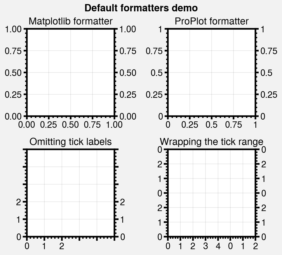
[3]:
import proplot as pplt
pplt.rc.linewidth = 2
pplt.rc.fontsize = 11
locator = [0, 0.25, 0.5, 0.75, 1]
fig, axs = pplt.subplots(ncols=2, nrows=2, refwidth=1.5, share=0)

# Formatter comparison
axs[0].format(
    xformatter='scalar', yformatter='scalar', title='Matplotlib formatter'
)
axs[1].format(yticklabelloc='both', title='ProPlot formatter')
axs[:2].format(xlocator=locator, ylocator=locator)

# Limiting the tick range
axs[2].format(
    title='Omitting tick labels', ticklen=5, xlim=(0, 5), ylim=(0, 5),
    xtickrange=(0, 2), ytickrange=(0, 2), xlocator=1, ylocator=1
)

# Setting the wrap range
axs[3].format(
    title='Wrapping the tick range', ticklen=5, xlim=(0, 7), ylim=(0, 6),
    xwraprange=(0, 5), ywraprange=(0, 3), xlocator=1, ylocator=1
)
axs.format(
    ytickloc='both', yticklabelloc='both',
    titlepad='0.5em', suptitle='Default formatters demo'
)
pplt.rc.reset()
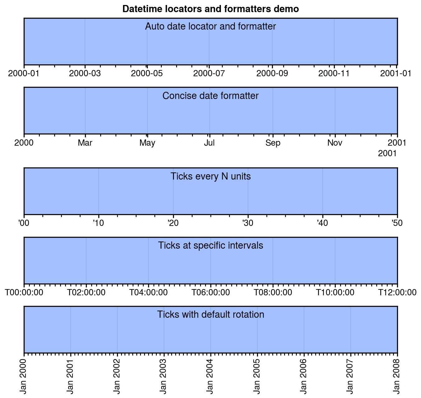
Datetime ticks
ProPlot can also be used to customize the tick locations and tick label
format of “datetime” axes. To draw ticks on some particular time unit, just
use a unit string (e.g., xlocator='month'). To draw ticks every N
time units, just use a (unit, N) tuple (e.g., xlocator=('day', 5)). For
% style formatting
of datetime tick labels, just use a string containing '%' (e.g.
xformatter='%Y-%m-%d'). See format,
Locator, and Formatter for
details.
[4]:
import proplot as pplt
import numpy as np
pplt.rc.update(
    linewidth=1.2, fontsize=10, ticklenratio=0.7,
    figurefacecolor='w', facecolor='pastel blue',
    titleloc='upper center', titleborder=False,
)
fig, axs = pplt.subplots(nrows=5, refwidth=6, refaspect=(8, 1), share=0)
axs[:4].format(xrotation=0)  # no rotation for these examples

# Default date locator
# This is enabled if you plot datetime data or set datetime limits
axs[0].format(
    xlim=(np.datetime64('2000-01-01'), np.datetime64('2001-01-02')),
    title='Auto date locator and formatter'
)

# Concise date formatter introduced in matplotlib 3.1
axs[1].format(
    xlim=(np.datetime64('2000-01-01'), np.datetime64('2001-01-01')),
    xformatter='concise', title='Concise date formatter',
)

# Minor ticks every year, major every 10 years
axs[2].format(
    xlim=(np.datetime64('2000-01-01'), np.datetime64('2050-01-01')),
    xlocator=('year', 10), xformatter='\'%y', title='Ticks every N units',
)

# Minor ticks every 10 minutes, major every 2 minutes
axs[3].format(
    xlim=(np.datetime64('2000-01-01T00:00:00'), np.datetime64('2000-01-01T12:00:00')),
    xlocator=('hour', range(0, 24, 2)), xminorlocator=('minute', range(0, 60, 10)),
    xformatter='T%H:%M:%S', title='Ticks at specific intervals',
)

# Month and year labels, with default tick label rotation
axs[4].format(
    xlim=(np.datetime64('2000-01-01'), np.datetime64('2008-01-01')),
    xlocator='year', xminorlocator='month',  # minor ticks every month
    xformatter='%b %Y', title='Ticks with default rotation',
)
axs.format(
    ylocator='null', suptitle='Datetime locators and formatters demo'
)
pplt.rc.reset()
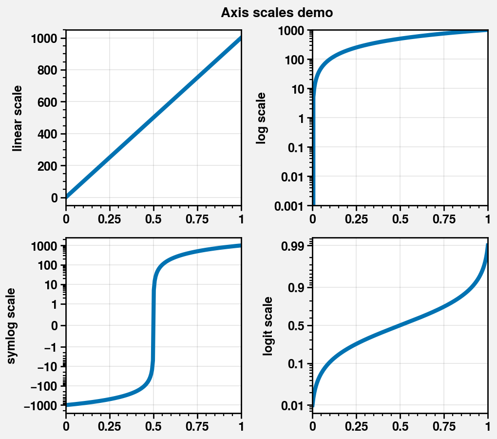
Changing the axis scale
“Axis scales” like 'linear' and 'log' control the x and y axis
coordinate system. To change the axis scale, simply pass e.g.
xscale='log' or yscale='log' to format. This
is powered by the Scale
constructor function.
ProPlot also makes several changes to the axis scale API:
By default, the
AutoFormatterformatter is used for all axis scales instead of e.g.LogFormatterforLogScalescales. This can be changed e.g. by passingxformatter='log'oryformatter='log'toformat.To make its behavior consistent with
LocatorandFormatter, theScaleconstructor function returns instances ofScaleBase, andset_xscaleandset_yscalenow accept these class instances in addition to string names like'log'.While matplotlib axis scales must be instantiated with an
Axisinstance (for backward compatibility reasons), ProPlot axis scales can be instantiated without the axis instance (e.g.pplt.LogScale()instead ofpplt.LogScale(ax.xaxis)).The default
subsfor the'symlog'axis scale is nownp.arange(1, 10), and the defaultlinthreshis now1. Also the'log'and'symlog'axis scales now accept the keywordsbase,linthresh,linscale, andsubsrather than keywords with trailingxory.
[5]:
import proplot as pplt
import numpy as np
N = 200
lw = 3
pplt.rc.update({
    'linewidth': 1, 'ticklabelweight': 'bold', 'axeslabelweight': 'bold'
})
fig, axs = pplt.subplots(ncols=2, nrows=2, refwidth=1.8, share=0)
axs.format(suptitle='Axis scales demo', ytickminor=True)

# Linear and log scales
axs[0].format(yscale='linear', ylabel='linear scale')
axs[1].format(ylim=(1e-3, 1e3), yscale='log', ylabel='log scale')
axs[:2].plot(np.linspace(0, 1, N), np.linspace(0, 1000, N), lw=lw)

# Symlog scale
ax = axs[2]
ax.format(yscale='symlog', ylabel='symlog scale')
ax.plot(np.linspace(0, 1, N), np.linspace(-1000, 1000, N), lw=lw)

# Logit scale
ax = axs[3]
ax.format(yscale='logit', ylabel='logit scale')
ax.plot(np.linspace(0, 1, N), np.linspace(0.01, 0.99, N), lw=lw)
pplt.rc.reset()
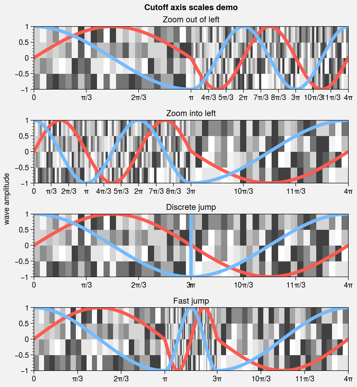
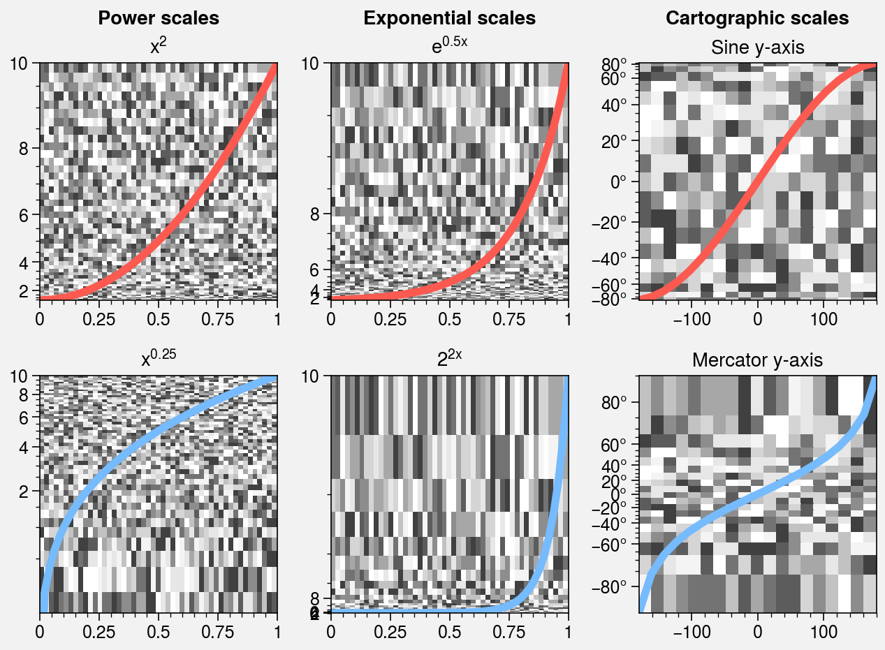
Special axis scales
ProPlot introduces several new axis scales. The 'cutoff' scale (see
CutoffScale) is useful when the statistical distribution
of your data is very unusual. The 'sine' scale (see
SineLatitudeScale) scales the axis with a sine function,
resulting in an area weighted spherical latitude coordinate, and the
'mercator' scale (see MercatorLatitudeScale) scales
the axis with the Mercator projection latitude coordinate. The
'inverse' scale (see InverseScale) can be useful when
working with spectral data, especially with
“dual” unit axes.
[6]:
import proplot as pplt
import numpy as np
fig, axs = pplt.subplots(nrows=4, refaspect=(5, 1), figwidth=6, sharex=False)
ax = axs[0]

# Sample data
x = np.linspace(0, 4 * np.pi, 100)
dy = np.linspace(-1, 1, 5)
y1 = np.sin(x)
y2 = np.cos(x)
state = np.random.RandomState(51423)
data = state.rand(len(dy) - 1, len(x) - 1)

# Loop through various cutoff scale options
titles = ('Zoom out of left', 'Zoom into left', 'Discrete jump', 'Fast jump')
args = (
    (np.pi, 3),  # speed up
    (3 * np.pi, 1 / 3),  # slow down
    (np.pi, np.inf, 3 * np.pi),  # discrete jump
    (np.pi, 5, 3 * np.pi)  # fast jump
)
locators = (
    np.pi / 3,
    np.pi / 3,
    np.pi * np.append(np.linspace(0, 1, 4), np.linspace(3, 4, 4)),
    np.pi * np.append(np.linspace(0, 1, 4), np.linspace(3, 4, 4)),
)
for ax, iargs, title, locator in zip(axs, args, titles, locators):
    ax.pcolormesh(x, dy, data, cmap='grays', cmap_kw={'right': 0.8})
    for y, color in zip((y1, y2), ('coral', 'sky blue')):
        ax.plot(x, y, lw=4, color=color)
    ax.format(
        xscale=('cutoff', *iargs), title=title,
        xlim=(0, 4 * np.pi), ylabel='wave amplitude',
        xformatter='pi', xlocator=locator,
        xtickminor=False, xgrid=True, ygrid=False, suptitle='Cutoff axis scales demo'
    )
[7]:
import proplot as pplt
import numpy as np
pplt.rc.reset()
fig, axs = pplt.subplots(nrows=2, ncols=3, refwidth=1.7, share=0, order='F')
axs.format(
    toplabels=('Power scales', 'Exponential scales', 'Cartographic scales'),
)
x = np.linspace(0, 1, 50)
y = 10 * x
state = np.random.RandomState(51423)
data = state.rand(len(y) - 1, len(x) - 1)

# Power scales
colors = ('coral', 'sky blue')
for ax, power, color in zip(axs[:2], (2, 1 / 4), colors):
    ax.pcolormesh(x, y, data, cmap='grays', cmap_kw={'right': 0.8})
    ax.plot(x, y, lw=4, color=color)
    ax.format(
        ylim=(0.1, 10), yscale=('power', power),
        title=f'$x^{{{power}}}$'
    )

# Exp scales
for ax, a, c, color in zip(axs[2:4], (np.e, 2), (0.5, 2), colors):
    ax.pcolormesh(x, y, data, cmap='grays', cmap_kw={'right': 0.8})
    ax.plot(x, y, lw=4, color=color)
    ax.format(
        ylim=(0.1, 10), yscale=('exp', a, c),
        title=f"${(a, 'e')[a == np.e]}^{{{(c, '')[c == 1]}x}}$"
    )

# Geographic scales
n = 20
x = np.linspace(-180, 180, n)
y1 = np.linspace(-85, 85, n)
y2 = np.linspace(-85, 85, n)
data = state.rand(len(x) - 1, len(y2) - 1)
for ax, scale, color in zip(axs[4:], ('sine', 'mercator'), ('coral', 'sky blue')):
    ax.plot(x, y1, '-', color=color, lw=4)
    ax.pcolormesh(x, y2, data, cmap='grays', cmap_kw={'right': 0.8})
    ax.format(
        title=scale.title() + ' y-axis', yscale=scale, ytickloc='left',
        yformatter='deg', grid=False, ylocator=20,
        xscale='linear', xlim=None, ylim=(-85, 85)
    )
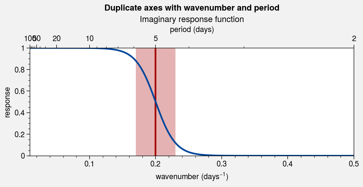
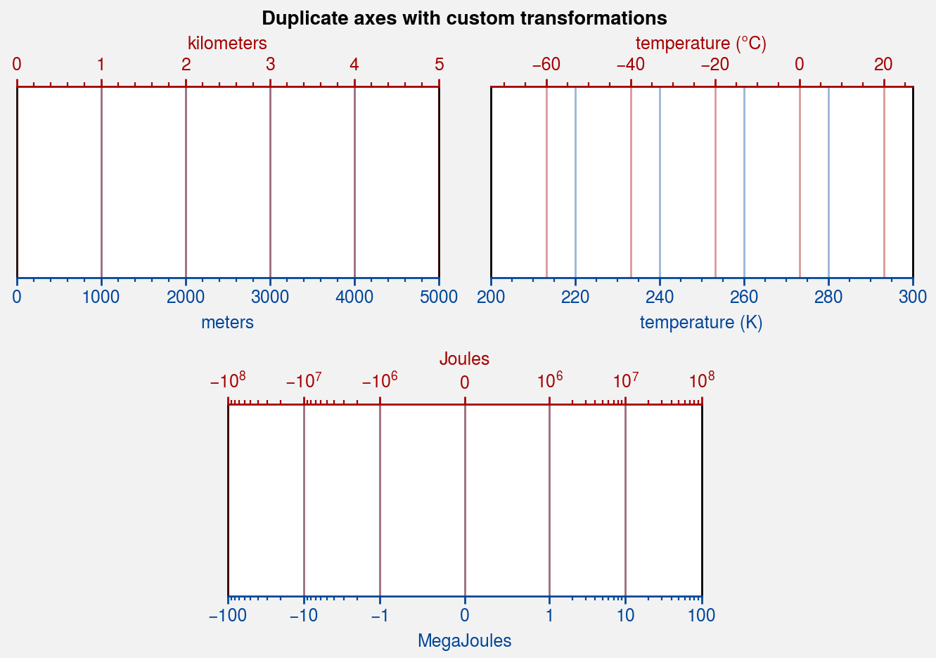
Dual unit axes
The dualx and
dualy methods can be used to draw duplicate
x and y axes meant to represent alternate units in the same
coordinate range as the “parent” axis. This feature is powered by the
FuncScale class.
dualx and dualy
accept either (1) a single linear forward function, (2) a pair of arbitrary
forward and inverse functions, or (3) a scale name or scale class instance.
In the latter case, the scale’s transforms are used for the forward and
inverse functions, and the scale’s default locators and formatters are used
for the default FuncScale locators and formatters.
In the below examples, we generate dual axes with each of these three methods. Note
that the “parent” axis scale is now arbitrary – in the first example shown below,
we create a dualx axis for an axis scaled by the
symlog scale.
[8]:
import proplot as pplt
pplt.rc.update({'grid.alpha': 0.4, 'linewidth': 1, 'grid.linewidth': 1})
c1 = pplt.scale_luminance('cerulean', 0.5)
c2 = pplt.scale_luminance('red', 0.5)
fig, axs = pplt.subplots(
    [[1, 1, 2, 2], [0, 3, 3, 0]],
    share=0, refaspect=2.2, refwidth=3
)
axs.format(
    suptitle='Duplicate axes with custom transformations',
    xcolor=c1, gridcolor=c1,
    ylocator=[], yformatter=[]
)

# Meters and kilometers
ax = axs[0]
ax.format(xlim=(0, 5000), xlabel='meters')
ax.dualx(
    lambda x: x * 1e-3,
    label='kilometers', grid=True, color=c2, gridcolor=c2
)

# Kelvin and Celsius
ax = axs[1]
ax.format(xlim=(200, 300), xlabel='temperature (K)')
ax.dualx(
    lambda x: x - 273.15,
    label='temperature (\N{DEGREE SIGN}C)', grid=True, color=c2, gridcolor=c2
)

# With symlog parent
ax = axs[2]
ax.format(xlim=(-100, 100), xscale='symlog', xlabel='MegaJoules')
ax.dualx(
    lambda x: x * 1e6,
    label='Joules', formatter='log', grid=True, color=c2, gridcolor=c2
)
pplt.rc.reset()
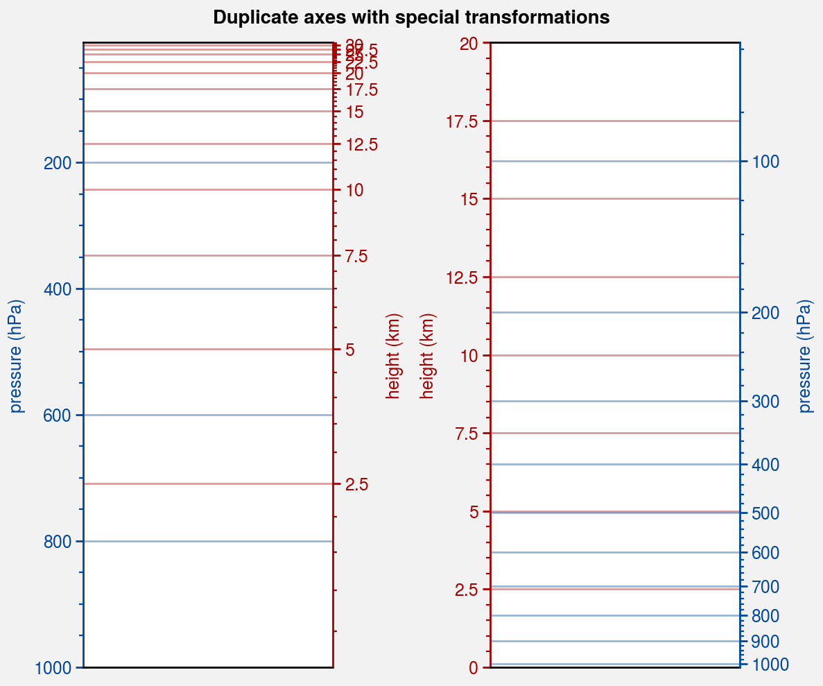
[9]:
import proplot as pplt
pplt.rc.update({'grid.alpha': 0.4, 'linewidth': 1, 'grid.linewidth': 1})
c1 = pplt.scale_luminance('cerulean', 0.5)
c2 = pplt.scale_luminance('red', 0.5)
fig, axs = pplt.subplots(ncols=2, share=0, refaspect=0.4, refwidth=1.8)
axs.format(suptitle='Duplicate axes with special transformations')

# Pressure as the linear scale, height on opposite axis (scale height 7km)
ax = axs[0]
ax.format(
    xformatter='null', ylabel='pressure (hPa)',
    ylim=(1000, 10), xlocator=[], ycolor=c1, gridcolor=c1
)
ax.dualy(
    'height', label='height (km)', ticks=2.5, color=c2, gridcolor=c2, grid=True
)

# Height as the linear scale, pressure on opposite axis (scale height 7km)
ax = axs[1]  # span
ax.format(
    xformatter='null', ylabel='height (km)', ylim=(0, 20), xlocator='null',
    grid=True, gridcolor=c2, ycolor=c2
)
ax.dualy(
    'pressure', label='pressure (hPa)', locator=100, color=c1, gridcolor=c1, grid=True,
)
pplt.rc.reset()
[10]:
import proplot as pplt
import numpy as np
pplt.rc.margin = 0
c1 = pplt.scale_luminance('cerulean', 0.5)
c2 = pplt.scale_luminance('red', 0.5)
fig, ax = pplt.subplots(refaspect=(3, 1), figwidth=6)

# Sample data
cutoff = 1 / 5
x = np.linspace(0.01, 0.5, 1000)  # in wavenumber days
response = (np.tanh(-((x - cutoff) / 0.03)) + 1) / 2  # response func
ax.axvline(cutoff, lw=2, ls='-', color=c2)
ax.fill_between([cutoff - 0.03, cutoff + 0.03], 0, 1, color=c2, alpha=0.3)
ax.plot(x, response, color=c1, lw=2)

# Add inverse scale to top
ax.format(
    xlabel='wavenumber (days$^{-1}$)', ylabel='response', grid=False,
    title='Imaginary response function',
    suptitle='Duplicate axes with wavenumber and period',
)
ax = ax.dualx(
    'inverse', locator='log', locator_kw={'subs': (1, 2, 5)}, label='period (days)'
)
pplt.rc.reset()