Plotting 2D data
ProPlot adds new features to various Axes
plotting methods using a set of “wrapper” functions. When a plotting method like
contourf is “wrapped” by one of these functions, it accepts
the same parameters as the wrapper. These additions are a strict superset of
matplotlib – if you are not interested, you can use matplotlib’s plotting methods
just like you always have. This section documents the features added by wrapper
functions to 2D plotting commands like contour,
contourf, pcolor, and
pcolormesh.
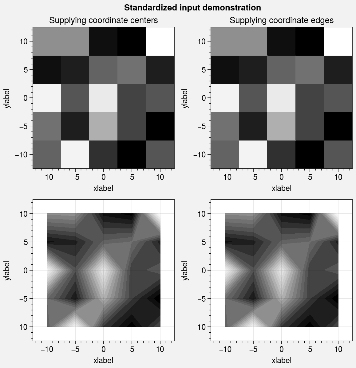
Standardized arguments
The standardize_2d wrapper standardizes
positional arguments across all 2D plotting methods.
standardize_2d lets you optionally omit the x and y
coordinates, in which case they are inferred from the data.
It also guesses coordinate edges for pcolor and
pcolormesh plots when you supply coordinate
centers, and calculates coordinate centers for
contourf and contour plots
when you supply coordinate edges. Notice the locations of the rectangle
edges in the pcolor plots shown below.
[1]:
import proplot as pplt
import numpy as np

# Sample data
state = np.random.RandomState(51423)
x = y = np.array([-10, -5, 0, 5, 10])
xedges = pplt.edges(x)
yedges = pplt.edges(y)
data = state.rand(y.size, x.size)  # "center" coordinates
lim = (np.min(xedges), np.max(xedges))

with pplt.rc.context({'image.cmap': 'Grays', 'image.levels': 21}):
    # Figure
    fig, axs = pplt.subplots(ncols=2, nrows=2, refwidth=2.3, share=False)
    axs.format(
        xlabel='xlabel', ylabel='ylabel',
        xlim=lim, ylim=lim, xlocator=5, ylocator=5,
        suptitle='Standardized input demonstration'
    )
    axs[0].format(title='Supplying coordinate centers')
    axs[1].format(title='Supplying coordinate edges')

    # Plot using both centers and edges as coordinates
    axs[0].pcolormesh(x, y, data)
    axs[1].pcolormesh(xedges, yedges, data)
    axs[2].contourf(x, y, data)
    axs[3].contourf(xedges, yedges, data)
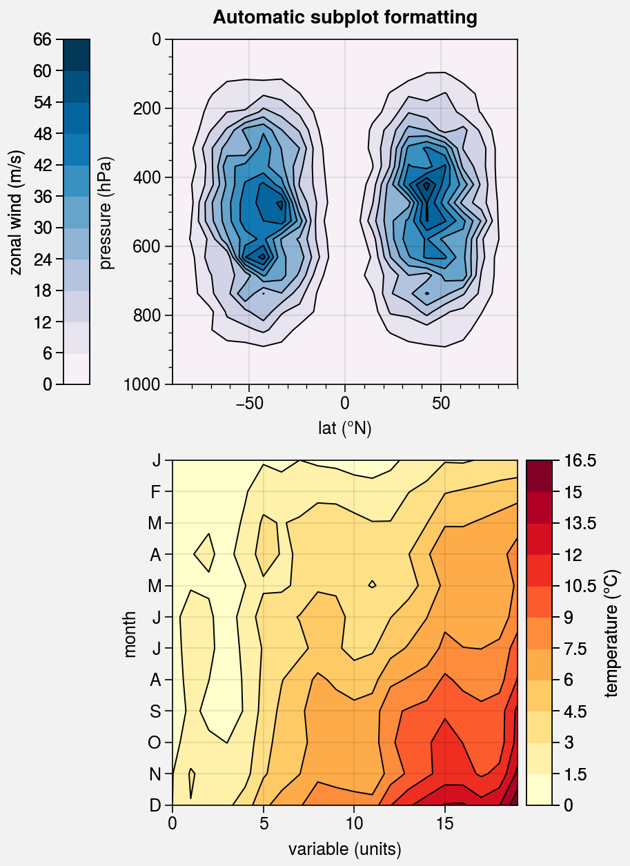
Pandas and xarray integration
The standardize_2d wrapper integrates 2D plotting
methods with pandas DataFrames and xarray DataArrays.
If you omitted x and y coordinates, standardize_2d tries to
retrieve them from the DataFrame or DataArray. If the coordinates are string
labels, standardize_2d converts them into indices and tick labels
using FixedLocator and IndexFormatter.
If you did not explicitly set the x-axis label, y-axis label, title, or
on-the-fly legend or colorbar label,
standardize_2d also tries to retrieve them from the DataFrame or
DataArray.
You can also pass a Dataset, DataFrame, or dictionary to any plotting
command using the data keyword, then pass dataset keys as positional
arguments instead of arrays. For example, ax.plot('z', data=dataset)
is translated to ax.plot(dataset['z']), and the x and y coordinates
are inferred thereafter.
These features restore some of the convenience you get
with the builtin pandas and xarray plotting functions. They are also
optional – installation of pandas and xarray are not required. All of
these features can be disabled by setting rc.autoformat to False
or by passing autoformat=False to any plotting command.
[2]:
import xarray as xr
import numpy as np
import pandas as pd

# DataArray
state = np.random.RandomState(51423)
linspace = np.linspace(0, np.pi, 20)
data = 50 * state.normal(1, 0.2, size=(20, 20)) * (
    np.sin(linspace * 2) ** 2
    * np.cos(linspace + np.pi / 2)[:, None] ** 2
)
lat = xr.DataArray(
    np.linspace(-90, 90, 20),
    dims=('lat',),
    attrs={'units': '\N{DEGREE SIGN}N'}
)
plev = xr.DataArray(
    np.linspace(1000, 0, 20),
    dims=('plev',),
    attrs={'long_name': 'pressure', 'units': 'hPa'}
)
da = xr.DataArray(
    data,
    name='u',
    dims=('plev', 'lat'),
    coords={'plev': plev, 'lat': lat},
    attrs={'long_name': 'zonal wind', 'units': 'm/s'}
)

# DataFrame
data = state.rand(12, 20)
df = pd.DataFrame(
    (data - 0.4).cumsum(axis=0).cumsum(axis=1),
    index=list('JFMAMJJASOND'),
)
df.name = 'temperature (\N{DEGREE SIGN}C)'
df.index.name = 'month'
df.columns.name = 'variable (units)'
[3]:
import proplot as pplt
fig, axs = pplt.subplots(nrows=2, refwidth=2.5, share=0)
axs.format(toplabels=('Automatic subplot formatting',))

# Plot DataArray
cmap = pplt.Colormap('PuBu', left=0.05)
axs[0].contourf(da, cmap=cmap, colorbar='l', lw=0.7, ec='k')
axs[0].format(yreverse=True)

# Plot DataFrame
axs[1].contourf(df, cmap='YlOrRd', colorbar='r', lw=0.7, ec='k')
axs[1].format(xtickminor=False, yreverse=True)
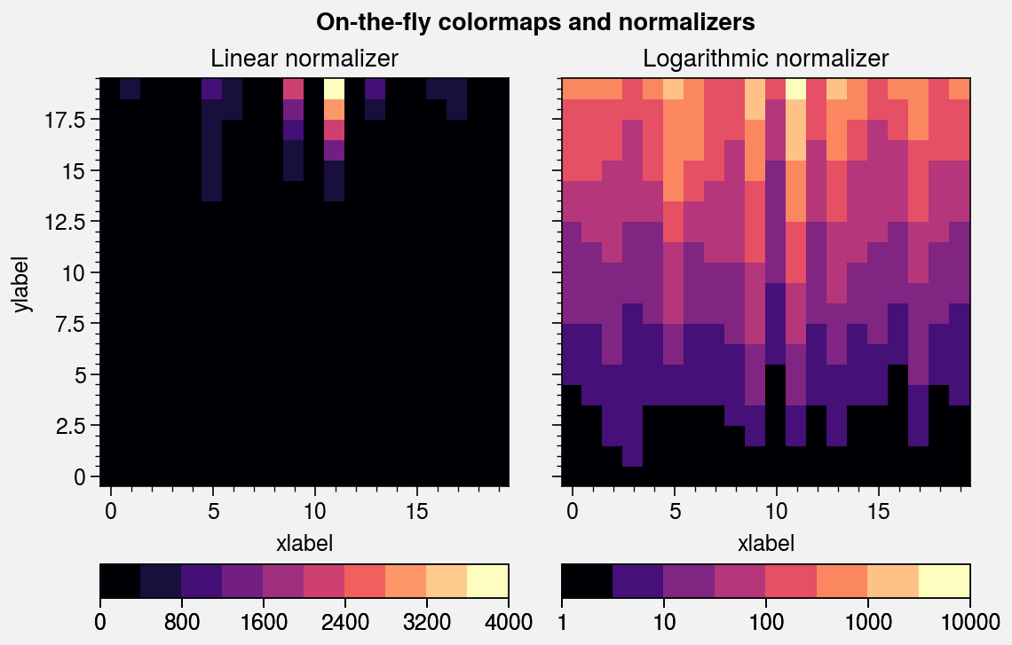
Colormaps and normalizers
It is often useful to create ProPlot colormaps on-the-fly, without
explicitly calling the Colormap
constructor function.
You can do so using the cmap and cmap_kw arguments, available with
plotting methods wrapped by apply_cmap. cmap and cmap_kw
are passed to Colormap and the resulting colormap is
used for the plot. For example, to create and apply a monochromatic colormap,
you can simply use cmap='color_name'.
The apply_cmap wrapper also
adds the norm and norm_kw arguments. They are passed to the
Norm constructor function,
and the resulting normalizer is used for the plot. By default,
apply_cmap selects the colormap normalization range based on
the data. The range can be set explicitly by passing the usual vmin and vmax
keywords to the plotting command (see the next section
for details).
For more information on colormaps and normalizers, see the colormaps section and this matplotlib tutorial.
Note
By default, when apply_cmap selects the colormap normalization
range, it ignores data outside of the x or y axis limits if they
were previously changed by set_xlim or
set_ylim (or, equivalently, by passing xlim or ylim
to proplot.axes.CartesianAxes.format). To disable this feature, pass
inbounds=False to the plotting command or set rc[‘image.inbounds’]
to False.
[4]:
import proplot as pplt
import numpy as np

# Sample data
N = 20
state = np.random.RandomState(51423)
data = 11 ** (0.25 * np.cumsum(state.rand(N, N), axis=0))

# Figure
fig, axs = pplt.subplots(ncols=2, refwidth=2.3, span=False)
axs.format(
    xlabel='xlabel', ylabel='ylabel', grid=True,
    suptitle='On-the-fly colormaps and normalizers'
)

# Plot with colormaps and normalizers
cmap = 'magma'
axs[0].pcolormesh(data, cmap=cmap, colorbar='b')
axs[1].pcolormesh(data, norm='log', cmap=cmap, colorbar='b')
axs[0].format(title='Linear normalizer')
axs[1].format(title='Logarithmic normalizer')
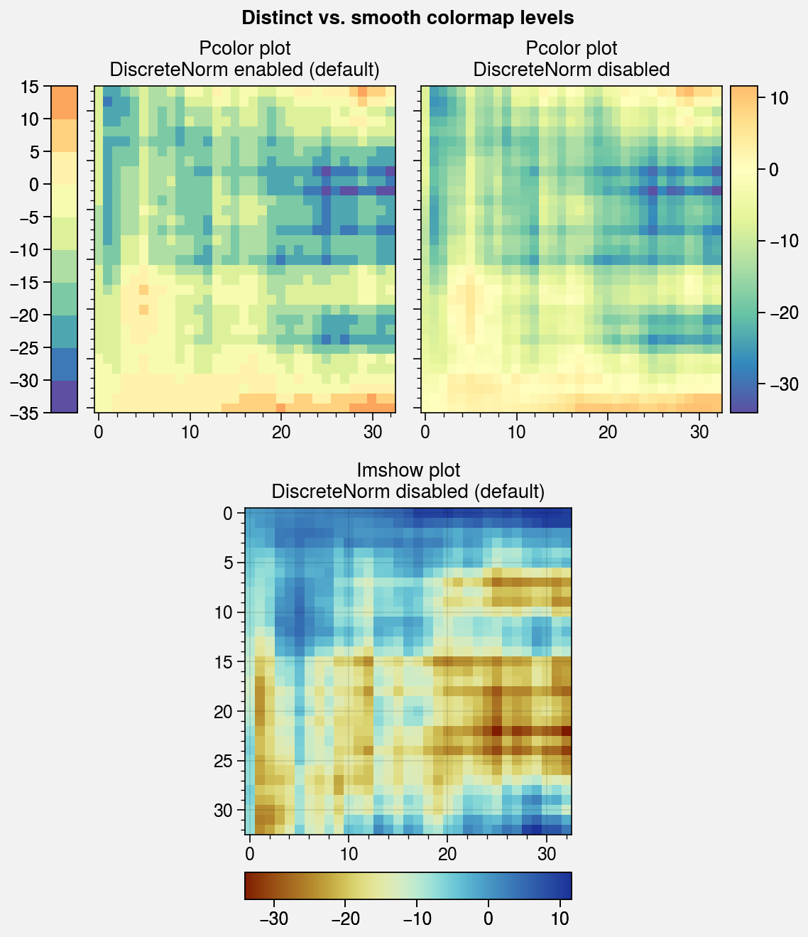
Distinct colormap levels
The apply_cmap wrapper also “discretizes” the colormaps
used with certain plots. This is done using DiscreteNorm,
which converts data values into colormap colors by first (1) transforming
the data using an arbitrary continuous normalizer (e.g.,
Normalize or LogNorm), then
(2) mapping the normalized data to distinct colormap levels. This is
similar to matplotlib’s BoundaryNorm. By default,
this feature is disabled for imshow,
matshow, spy,
hexbin, and hist2d plots.
To explicitly toggle it, pass discrete=true_or_false to any plotting
command wrapped by apply_cmap or change rc[‘image.discrete’].
Applying DiscreteNorm to every colormap lets us easily
draw matplotlib.axes.Axes.pcolor and pcolormesh
plots with distinct levels. Distinct levels can help the reader
discern exact numeric values and tends to reveal qualitative structure in
the data. They are also critical for users that would prefer contours,
but have complex 2D coordinate matrices that trip up the contouring
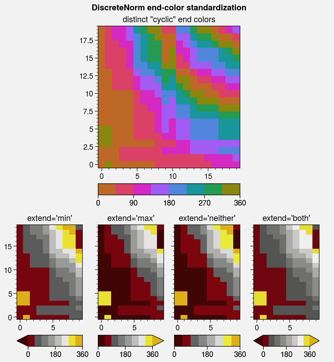
algorithm. DiscreteNorm also fixes the colormap
end-colors by ensuring the following conditions are met (this may seem
nitpicky, but it is crucial for plots with very few levels):
All colormaps always span the entire color range, independent of the
extendsetting.Cyclic colormaps always have distinct color levels on either end of the colorbar.
The colormap levels used with DiscreteNorm can be configured
with the levels, values, or N keywords. If you pass an integer to
one of these keywords, approximately that many boundaries are automatically
generated at “nice” intervals. The keywords vmin, vmax, and locator
control how the automatic intervals are chosen. You can also use
the positive, negative, and symmetric keywords to ensure that
automatically-generated levels are strictly positive, strictly negative,
or symmetric about zero (respectively). To generate your own level lists,
the proplot.utils.arange and proplot.utils.edges commands may be useful.
[5]:
import proplot as pplt
import numpy as np

# Sample data
state = np.random.RandomState(51423)
data = (state.normal(0, 1, size=(33, 33))).cumsum(axis=0).cumsum(axis=1)

# Figure
fig, axs = pplt.subplots([[1, 1, 2, 2], [0, 3, 3, 0]], ref=3, refwidth=2.3)
axs.format(yformatter='none', suptitle='Distinct vs. smooth colormap levels')

# Pcolor with DivergingNorm
axs[0].pcolor(data, cmap='spectral_r', norm='div', colorbar='l')
axs[0].set_title('Pcolor plot\nDiscreteNorm enabled (default)')
axs[1].pcolor(data, discrete=False, cmap='spectral_r', norm='div', colorbar='r')
axs[1].set_title('Pcolor plot\nDiscreteNorm disabled')

# Imshow
m = axs[2].imshow(data, cmap='roma', colorbar='b')
axs[2].format(title='Imshow plot\nDiscreteNorm disabled (default)', yformatter='auto')
[6]:
import proplot as pplt
import numpy as np

# Sample data
state = np.random.RandomState(51423)
data = (20 * (state.rand(20, 20) - 0.4).cumsum(axis=0).cumsum(axis=1)) % 360
levels = pplt.arange(0, 360, 45)

# Figure
fig, axs = pplt.subplots(
    [[0, 1, 1, 0], [2, 3, 4, 5]],
    wratios=(1, 1, 1, 1), hratios=(1.5, 1),
    refwidth=2.4, refaspect=1, right='2em'
)
axs.format(suptitle='DiscreteNorm end-color standardization')

# Cyclic colorbar with distinct end colors
ax = axs[0]
ax.pcolormesh(
    data, levels=levels, cmap='phase', extend='neither',
    colorbar='b', colorbar_kw={'locator': 90}
)
ax.format(title='distinct "cyclic" end colors')

# Colorbars with different extend values
for ax, extend in zip(axs[1:], ('min', 'max', 'neither', 'both')):
    ax.pcolormesh(
        data[:, :10], levels=levels, cmap='oxy',
        extend=extend, colorbar='b', colorbar_kw={'locator': 180}
    )
    ax.format(title=f'extend={extend!r}')
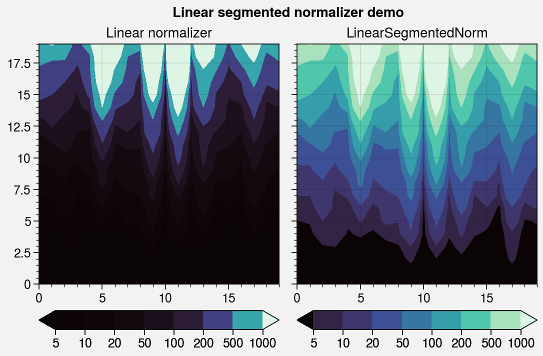
Special colormap normalizers
The LinearSegmentedNorm colormap normalizer
provides even color gradations with respect to index for an
arbitrary monotonically increasing list of levels. This is automatically applied
if you pass unevenly spaced levels to a plotting command, or it can be manually
applied using e.g. norm='segmented'.
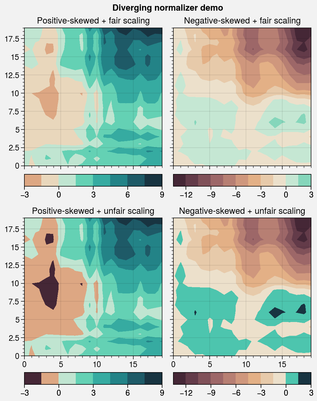
The DivergingNorm normalizer
ensures the colormap midpoint lies on some central data value (usually 0),
even if vmin, vmax, or levels are asymmetric with respect to the central
value. This can be applied using e.g. norm='diverging' and configured
to scale colors “fairly” or “unfairly”:
With fair scaling (the default), gradations on either side of the midpoint have equal intensity. If
vminandvmaxare not symmetric about zero, the most intense colormap colors on one side of the midpoint will be truncated.With unfair scaling, gradations on either side of the midpoint are warped so that the full range of colormap colors is traversed. This configuration should be used with care, as it may lead you to misinterpret your data!
The below example demonstrates how these normalizers can be used for datasets with unusual statistical distributions.
[7]:
import proplot as pplt
import numpy as np

# Sample data
state = np.random.RandomState(51423)
data = 11 ** (2 * state.rand(20, 20).cumsum(axis=0) / 7)

# Linear segmented norm
fig, axs = pplt.subplots(ncols=2, refwidth=2.4)
ticks = [5, 10, 20, 50, 100, 200, 500, 1000]
for i, (norm, title) in enumerate(zip(
    ('linear', 'segmented'),
    ('Linear normalizer', 'LinearSegmentedNorm')
)):
    m = axs[i].contourf(
        data, levels=ticks, extend='both',
        cmap='Mako', norm=norm,
        colorbar='b', colorbar_kw={'ticks': ticks},
    )
    axs[i].format(title=title)
axs.format(suptitle='Linear segmented normalizer demo')
[8]:
import proplot as pplt
import numpy as np

# Sample data
state = np.random.RandomState(51423)
data1 = (state.rand(20, 20) - 0.485).cumsum(axis=1).cumsum(axis=0)
data2 = (state.rand(20, 20) - 0.515).cumsum(axis=0).cumsum(axis=1)

# Figure
fig, axs = pplt.subplots(nrows=2, ncols=2, refwidth=2.2, order='F')
axs.format(suptitle='Diverging normalizer demo')
cmap = pplt.Colormap('DryWet', cut=0.1)

# Diverging norms
i = 0
for data, mode, fair, locator in zip(
    (data1, data2),
    ('positive', 'negative'),
    ('fair', 'unfair'),
    (3, 3),
):
    for fair in ('fair', 'unfair'):
        norm = pplt.Norm('diverging', fair=(fair == 'fair'))
        ax = axs[i]
        m = ax.contourf(data, cmap=cmap, norm=norm)
        ax.colorbar(m, loc='b', locator=locator)
        ax.format(title=f'{mode.title()}-skewed + {fair} scaling')
        i += 1
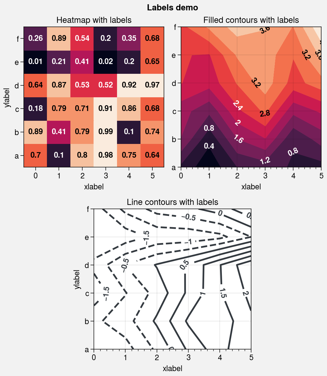
Contour and gridbox labels
The apply_cmap wrapper lets you quickly add
labels to heatmap, pcolor,
pcolormesh, contour, and
contourf plots by simply using labels=True.
The label text is colored black or white depending on the luminance of
the underlying grid box or filled contour.
apply_cmap draws contour labels with
clabel and grid box labels with
text. You can pass keyword arguments to these
functions using a labels_kw dictionary keyword argument, and change the
label precision with the precision keyword. See
apply_cmap for details.
[9]:
import proplot as pplt
import pandas as pd
import numpy as np

# Sample data
state = np.random.RandomState(51423)
data = state.rand(6, 6)
data = pd.DataFrame(data, index=pd.Index(['a', 'b', 'c', 'd', 'e', 'f']))

# Figure
fig, axs = pplt.subplots(
    [[1, 1, 2, 2], [0, 3, 3, 0]],
    refwidth=2.3, share=1, span=False,
)
axs.format(xlabel='xlabel', ylabel='ylabel', suptitle='Labels demo')

# Heatmap with labeled boxes
ax = axs[0]
m = ax.heatmap(
    data, cmap='rocket', labels=True,
    precision=2, labels_kw={'weight': 'bold'}
)
ax.format(title='Heatmap with labels')

# Filled contours with labels
ax = axs[1]
m = ax.contourf(
    data.cumsum(axis=0), labels=True,
    cmap='rocket', labels_kw={'weight': 'bold'}
)
ax.format(title='Filled contours with labels')

# Line contours with labels
ax = axs[2]
ax.contour(
    data.cumsum(axis=1) - 2, color='gray8',
    labels=True, lw=2, labels_kw={'weight': 'bold'}
)
ax.format(title='Line contours with labels')
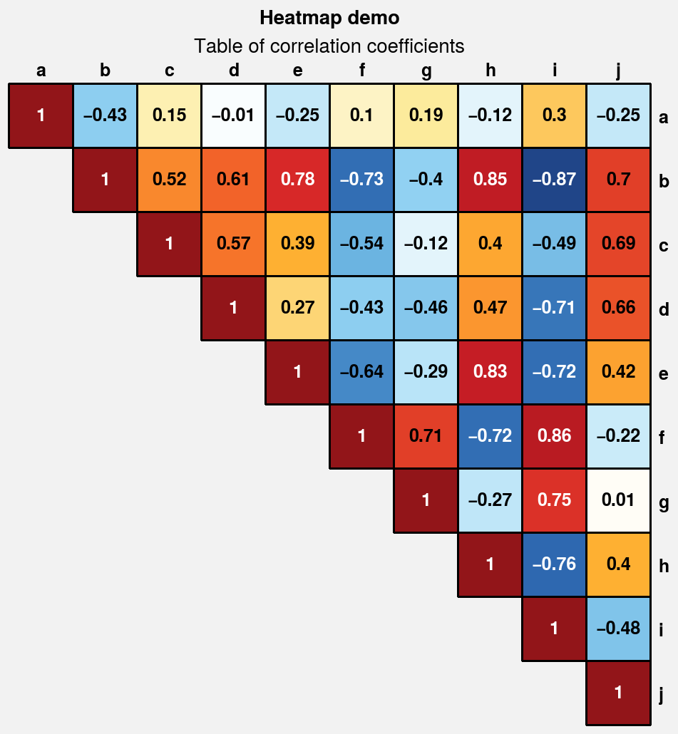
Heatmap plots
The new heatmap command calls
pcolormesh and configures the
axes with settings that are suitable for heatmaps –
fixed aspect ratio, no gridlines, no minor ticks,
and major ticks at the center of each box. Among other
things, this is useful for displaying covariance and
correlation matrices, as shown below. This should
generally only be used with CartesianAxes.
[10]:
import proplot as pplt
import numpy as np
import pandas as pd

# Covariance data
state = np.random.RandomState(51423)
data = state.normal(size=(10, 10)).cumsum(axis=0)
data = (data - data.mean(axis=0)) / data.std(axis=0)
data = (data.T @ data) / data.shape[0]
data[np.tril_indices(data.shape[0], -1)] = np.nan  # fill half with empty boxes
data = pd.DataFrame(data, columns=list('abcdefghij'), index=list('abcdefghij'))

# Covariance matrix plot
fig, ax = pplt.subplots(refwidth=4.5)
m = ax.heatmap(
    data, cmap='ColdHot', vmin=-1, vmax=1, N=100,
    lw=0.5, edgecolor='k', labels=True, labels_kw={'weight': 'bold'},
    clip_on=False,  # turn off clipping so box edges are not cut in half
)
ax.format(
    suptitle='Heatmap demo', title='Table of correlation coefficients', alpha=0,
    xloc='top', yloc='right', yreverse=True, ticklabelweight='bold', linewidth=0,
    ytickmajorpad=4,  # the ytick.major.pad rc setting; adds extra space
)