The basics
Creating figures
ProPlot works by creating a proplot.figure.Figure subclass of the
matplotlib figure class Figure, and a proplot.axes.Axes
subclass of the matplotlib axes class Axes.
The subplots command is used to create ProPlot figures. Modeled after
matplotlib.pyplot.subplots, it generates a proplot.figure.Figure instance filled
with proplot.axes.Axes instances. subplots can be used as follows:
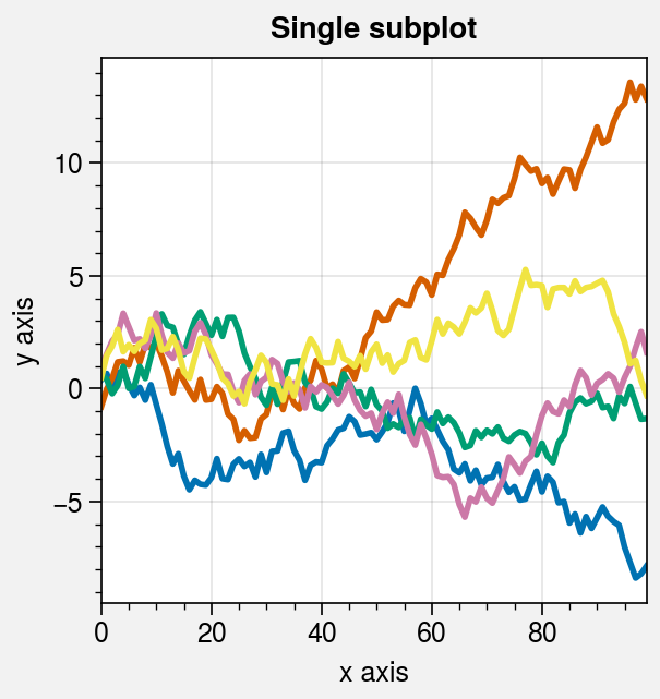
With no arguments,
subplotsreturns a figure with a single subplot.With
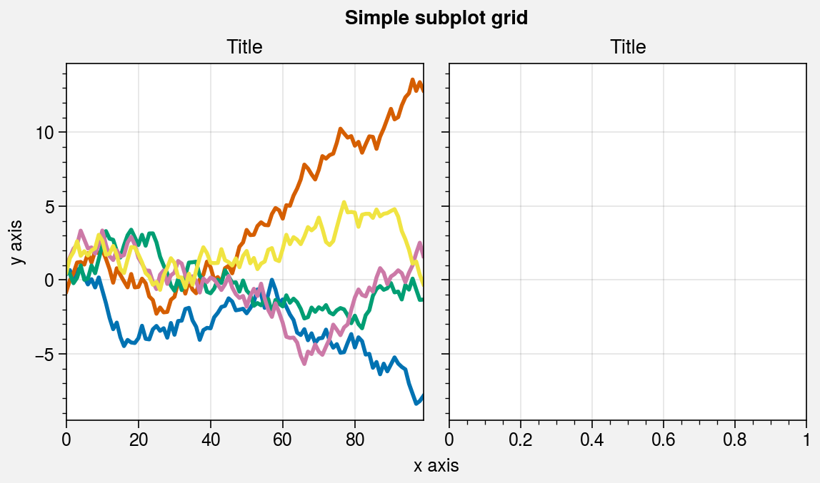
ncolsornrows,subplotsreturns a figure with a simple grid of subplots.With
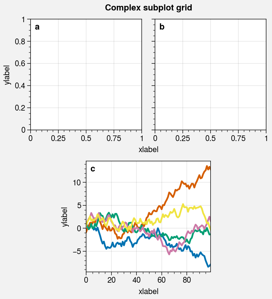
array,subplotsreturns an arbitrarily complex grid of subplots. This is a 2D array representing a “picture” of the subplot layout, where each unique integer indicates aGridSpecslot that is occupied by the corresponding subplot and0indicates an empty space.
Figures can be saved with proplot.figure.Figure.save (or, equivalently,
savefig). Tildes in the filename are expanded
with os.path.expanduser. In the below examples, we create a few simple figures
with subplots. See the next sections for details.
Note
ProPlot changes the default rc[‘figure.facecolor’] so that the figure
backgrounds shown by the matplotlib backend are gray (the
rc[‘savefig.facecolor’] applied to saved figures is still white). This can be
helpful when designing figures. ProPlot also controls the appearence of figures
in Jupyter notebooks using the new rc.inlinefmt setting, which is passed
to config_inline_backend on import. This imposes a
higher-quality default “inline” format
and disables the backend-specific settings InlineBackend.rc and
InlineBackend.print_figure_kwargs, ensuring that the figures you save
look identical to the figures displayed by the backend.
ProPlot also changes the default rc[‘savefig.format’] from PNG to
PDF for the following reasons:
Vector graphic formats are infinitely scalable.
Vector graphic formats are preferred by academic journals.
Nearly all academic journals accept figures in the PDF format alongside the EPS format.
The EPS format is outdated and does not support transparent graphic elements.
In case you do need a raster format like PNG, ProPlot increases the
default rc[‘savefig.dpi’] to 1000 dots per inch, which is
recommended by most journals
as the minimum resolution for rasterized figures containing lines and text.
See the configuration section for how to change
these settings.
Warning
ProPlot enables “axis sharing” by default. This lets subplots in the same row or
column share the same axis limits, scales, ticks, and labels. This is often
convenient, but may be annoying for some users. To keep this feature turned off,
simply change the default settings with e.g.
pplt.rc.update(share=False, span=False). See the
axis-sharing section for details.
[1]:
# Sample data
import numpy as np
state = np.random.RandomState(51423)
data = 2 * (state.rand(100, 5) - 0.5).cumsum(axis=0)
[2]:
# Single subplot
import proplot as pplt
fig, ax = pplt.subplots()
ax.plot(data, lw=2)
ax.format(suptitle='Single subplot', xlabel='x axis', ylabel='y axis')
# Save the figure
fig.save('~/test1.png')
[3]:
# Simple subplot grid
import proplot as pplt
fig, axs = pplt.subplots(ncols=2)
axs[0].plot(data, lw=2)
axs[0].format(xticks=20, xtickminor=False)
axs.format(
    suptitle='Simple subplot grid', title='Title',
    xlabel='x axis', ylabel='y axis'
)
# Save the figure
fig.save('~/test2.png')
[4]:
# Complex grid
import proplot as pplt
array = [  # the "picture" (0 == nothing, 1 == subplot A, 2 == subplot B, etc.)
    [1, 1, 2, 2],
    [0, 3, 3, 0],
]
fig, axs = pplt.subplots(array, refwidth=1.8)
axs.format(
    abc=True, abcloc='ul', suptitle='Complex subplot grid',
    xlabel='xlabel', ylabel='ylabel'
)
axs[2].plot(data, lw=2)
# Save the figure
fig.save('~/test3.png')
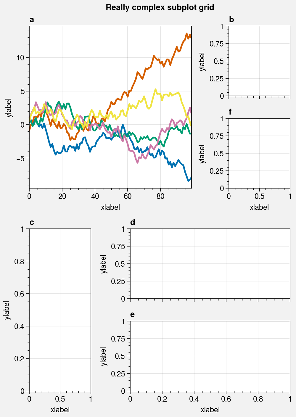
[5]:
# Really complex grid
import proplot as pplt
array = [  # the "picture" (1 == subplot A, 2 == subplot B, etc.)
    [1, 1, 2],
    [1, 1, 6],
    [3, 4, 4],
    [3, 5, 5],
]
fig, axs = pplt.subplots(array, figwidth=5, span=False)
axs.format(
    suptitle='Really complex subplot grid',
    xlabel='xlabel', ylabel='ylabel', abc=True
)
axs[0].plot(data, lw=2)
# Save the figure
fig.save('~/test4.png')
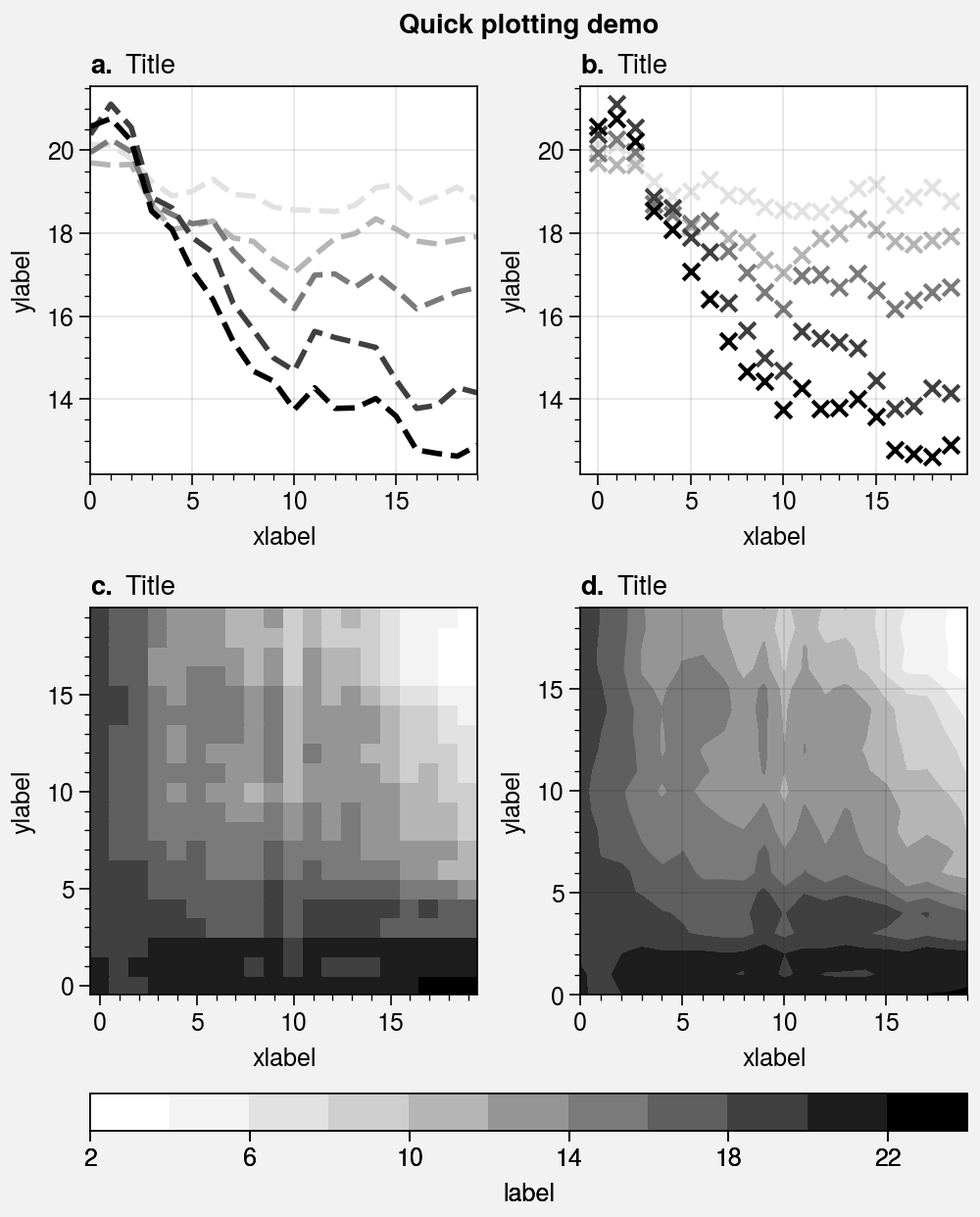
Plotting stuff
Matplotlib has
two different interfaces:
an object-oriented interface and a MATLAB-style pyplot interface
(which uses the object-oriented interface internally). Plotting with ProPlot is
just like plotting with matplotlib’s object-oriented interface. Proplot builds
upon the matplotlib constructs of the Figure and the
Axes by adding new commands and adding new features to
existing commands. These additions do not change the usage or syntax of existing
commands, which means a shallow learning curve for the average matplotlib user.
In the below example, we create a 4-panel figure with the familiar matplotlib
commands plot, scatter,
pcolormesh, and contourf.
See the 1d plotting and 2d plotting
sections for details on the features added by ProPlot.
[6]:
import proplot as pplt
import numpy as np

# Sample data
N = 20
state = np.random.RandomState(51423)
data = N + (state.rand(N, N) - 0.55).cumsum(axis=0).cumsum(axis=1)

# Example plots
cycle = pplt.Cycle('greys', left=0.2, N=5)
fig, axs = pplt.subplots(ncols=2, nrows=2, figwidth=5, share=0)
axs[0].plot(data[:, :5], linewidth=2, linestyle='--', cycle=cycle)
axs[1].scatter(data[:, :5], marker='x', cycle=cycle)
axs[2].pcolormesh(data, cmap='greys')
m = axs[3].contourf(data, cmap='greys')
axs.format(
    abc=True, abcstyle='a.', titleloc='l', title='Title',
    xlabel='xlabel', ylabel='ylabel', suptitle='Quick plotting demo'
)
fig.colorbar(m, loc='b', label='label')
[6]:
<matplotlib.colorbar.Colorbar at 0x7f56edce3af0>
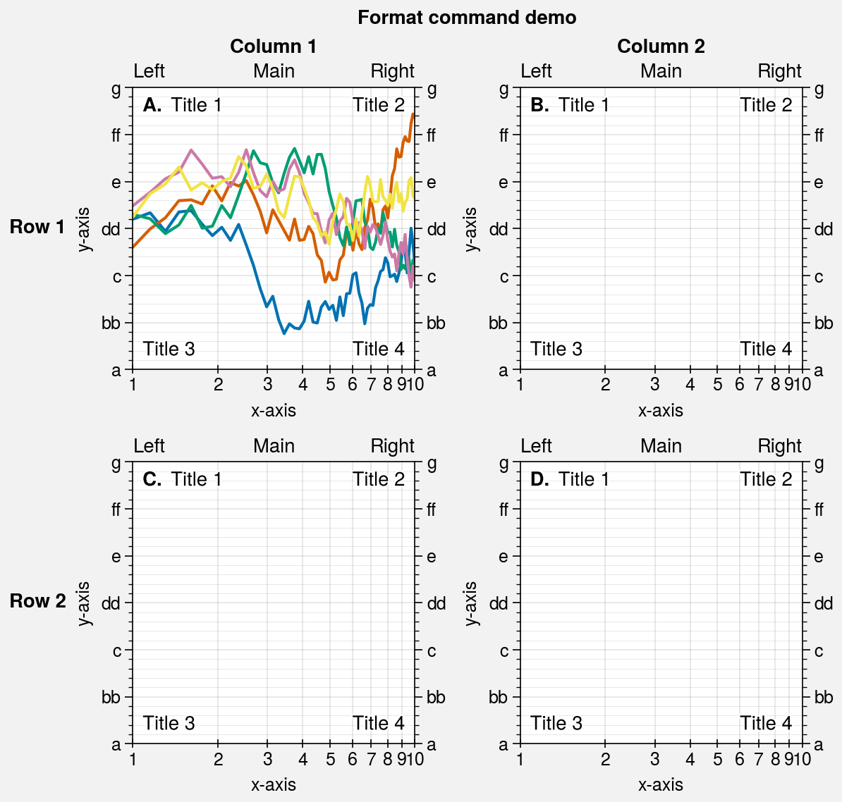
Formatting stuff
Every Axes returned by subplots has a
format method. This is your one-stop-shop for changing axes settings.
Keyword arguments passed to format are interpreted as follows:
Any keyword matching the name of an
rcsetting is used to update the axes. If the name has “dots”, you can omit them (e.g.,titleloc='left'changes therc[‘title.loc’]property). See the configuration section for details.Valid keywords arguments are passed to
proplot.axes.CartesianAxes.format,proplot.axes.PolarAxes.format, orproplot.axes.GeoAxes.format. These change settings that are specific to the axes type. For example:To change the x axis bounds on a
CartesianAxes, use e.g.xlim=(0, 5).To change the radial bounds on a
PolarAxes, use e.g.rlim=(0, 10).To change the meridional bounds on a
GeoAxes, use e.g.lonlim=(-90, 0).
Remaining keyword arguments are passed to the base
proplot.axes.Axes.formatmethod.Axesis the base class for all other axes classes. This changes things that are the same for all axes types, like titles and a-b-c subplot labels (e.g.,title='Title').
The format methods let you use simple shorthands for changing all kinds
of settings at once, instead of one-liner setter methods like
ax.set_title() and ax.set_xlabel(). They are also integrated with
the Locator, Formatter,
and Scale constructor functions
(see this section).
The below example shows the many different keyword arguments accepted by
format, and demonstrates how format can be used to succinctly and
efficiently customize your plots.
[7]:
import proplot as pplt
import numpy as np
fig, axs = pplt.subplots(ncols=2, nrows=2, share=0, tight=True, refwidth=2)
state = np.random.RandomState(51423)
N = 60
x = np.linspace(1, 10, N)
y = (state.rand(N, 5) - 0.5).cumsum(axis=0)
axs[0].plot(x, y, linewidth=1.5)
axs.format(
    suptitle='Format command demo',
    abc=True, abcloc='ul', abcstyle='A.',
    title='Main', ltitle='Left', rtitle='Right',  # different titles
    ultitle='Title 1', urtitle='Title 2', lltitle='Title 3', lrtitle='Title 4',
    toplabels=('Column 1', 'Column 2'),
    leftlabels=('Row 1', 'Row 2'),
    xlabel='x-axis', ylabel='y-axis',
    xscale='log',
    xlim=(1, 10), xticks=1,
    ylim=(-3, 3), yticks=pplt.arange(-3, 3),
    yticklabels=('a', 'bb', 'c', 'dd', 'e', 'ff', 'g'),
    ytickloc='both', yticklabelloc='both',
    xtickdir='inout', xtickminor=False, ygridminor=True,
)
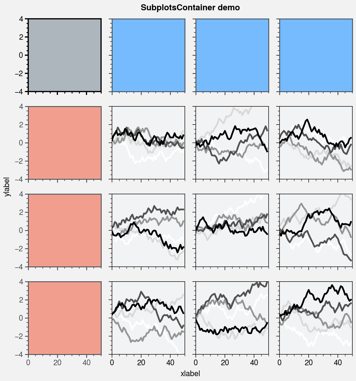
Subplot containers
matplotlib.pyplot.subplots returns a 2D ndarray for figures with more
than one column and row, a 1D ndarray for single-row or column figures,
or a lone Axes instance for single-subplot figures. By contrast,
proplot.ui.subplots returns a SubplotsContainer that
unifies these three possible return values:
SubplotsContainerpermits 2D indexing, e.g.axs[1, 0]. Sincesubplotscan generate figures with arbitrarily complex subplot geometry, this 2D indexing is useful only when the arrangement happens to be a clean 2D matrix.SubplotsContainerpermits 1D indexing, e.g.axs[0]. The default order can be switched from row-major to column-major by passingorder='F'tosubplots.When it is singleton,
SubplotsContainerbehaves like a scalar. So when you make a single axes withfig, axs = pplt.subplots(),axs[0].method(...)is equivalent toaxs.method(...).
SubplotsContainer is especially useful because it lets you call
Axes methods simultaneously for all subplots in the container.
In the below example, we use the SubplotsContainer returned by
subplots with the proplot.axes.Axes.format command to format
several subplots at once.
[8]:
import proplot as pplt
import numpy as np
state = np.random.RandomState(51423)
fig, axs = pplt.subplots(ncols=4, nrows=4, refwidth=1.2)
axs.format(
    xlabel='xlabel', ylabel='ylabel', suptitle='SubplotsContainer demo',
    grid=False, xlim=(0, 50), ylim=(-4, 4)
)

# Various ways to select subplots in the container
axs[:, 0].format(facecolor='blush', color='gray7', linewidth=1)
axs[0, :].format(facecolor='sky blue', color='gray7', linewidth=1)
axs[0].format(color='black', facecolor='gray5', linewidth=1.4)
axs[1:, 1:].format(facecolor='gray1')
for ax in axs[1:, 1:]:
    ax.plot((state.rand(50, 5) - 0.5).cumsum(axis=0), cycle='Grays', lw=2)
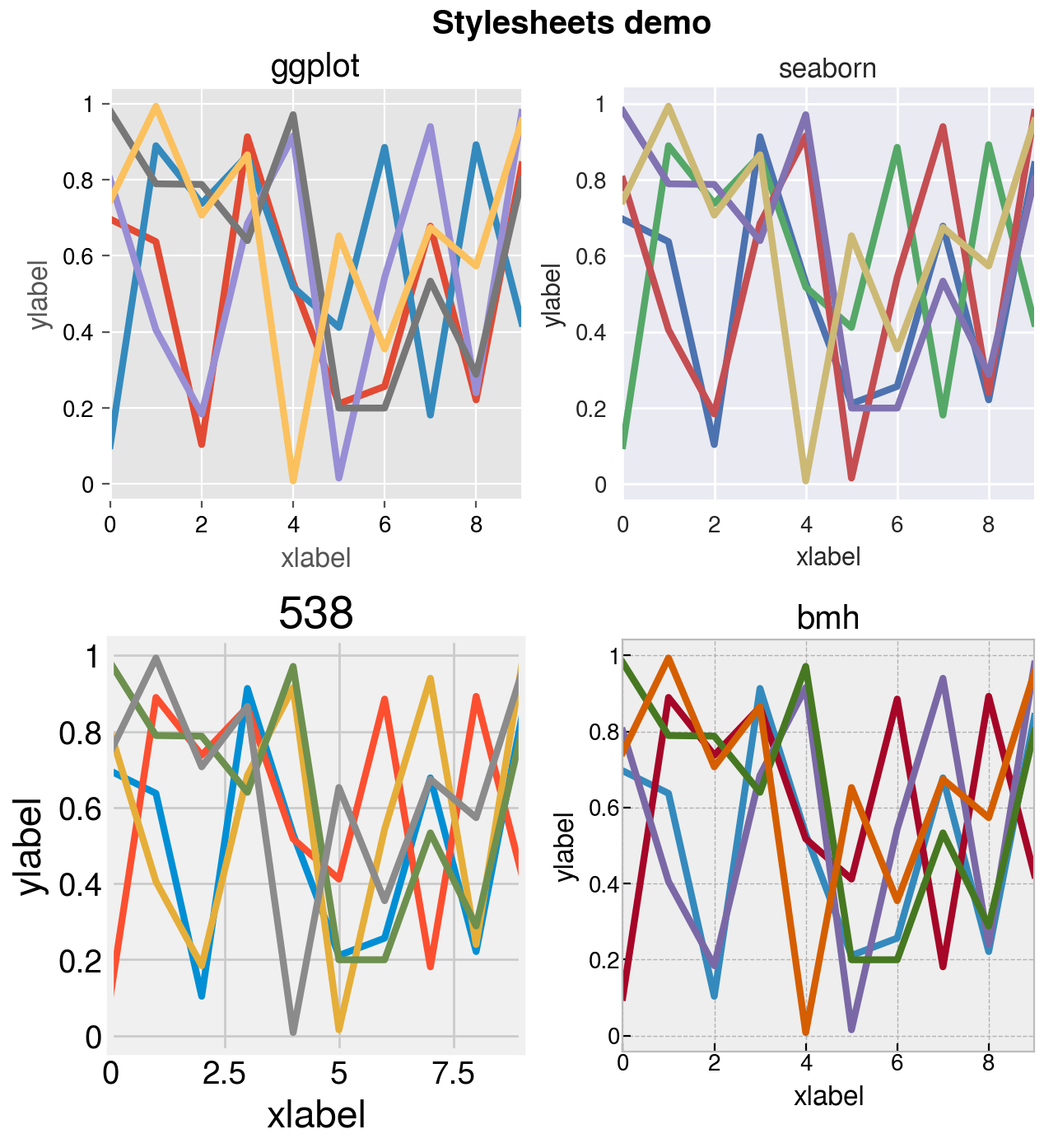
Settings and styles
A special object named rc is created whenever you import
ProPlot. rc is similar to the matplotlib
rcParams dictionary, but can be used to change both
matplotlib settings and
ProPlot settings. rc also
provides a style parameter that can be used to switch between
matplotlib stylesheets.
See the configuration section for details.
To modify a setting for just one subplot, you can pass it to the
proplot.axes.Axes.format method. To temporarily
modify setting(s) for a block of code, use
context. To modify setting(s) for the
entire python session, just assign it to the rc object or
use update. To reset everything to the
default state, use reset. See the below
example.
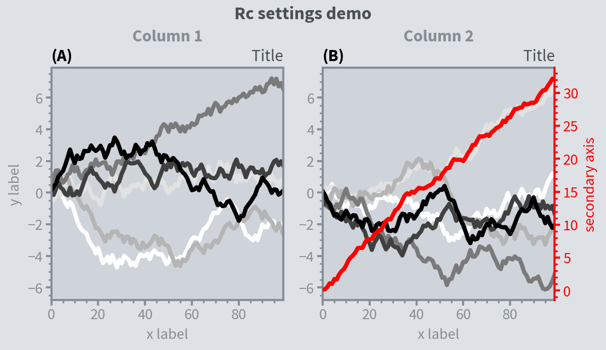
[9]:
import proplot as pplt
import numpy as np

# Update global settings in several different ways
pplt.rc.cycle = 'colorblind'
pplt.rc.color = 'gray6'
pplt.rc.update({'fontname': 'Source Sans Pro', 'fontsize': 11})
pplt.rc['figure.facecolor'] = 'gray3'
pplt.rc.axesfacecolor = 'gray4'
# pplt.rc.save()  # save the current settings to ~/.proplotrc

# Apply settings to figure with context()
with pplt.rc.context({'suptitle.size': 13}, toplabelcolor='gray6', linewidth=1.5):
    fig, axs = pplt.subplots(ncols=2, figwidth=6, sharey=2, span=False)

# Plot lines
N, M = 100, 6
state = np.random.RandomState(51423)
values = np.arange(1, M + 1)
for i, ax in enumerate(axs):
    data = np.cumsum(state.rand(N, M) - 0.5, axis=0)
    lines = ax.plot(data, linewidth=3, cycle='Grays')

# Apply settings to axes with format()
axs.format(
    grid=False, xlabel='x label', ylabel='y label',
    toplabels=('Column 1', 'Column 2'),
    suptitle='Rc settings demo',
    suptitlecolor='gray7',
    abc=True, abcloc='l', abcstyle='(A)',
    title='Title', titleloc='r', titlecolor='gray7'
)
ay = axs[-1].twinx()
ay.format(ycolor='red', linewidth=1.5, ylabel='secondary axis')
ay.plot((state.rand(100) - 0.2).cumsum(), color='r', lw=3)

# Reset persistent modifications from head of cell
pplt.rc.reset()
[10]:
import proplot as pplt
import numpy as np
# pplt.rc.style = 'style'  # set the style everywhere

# Sample data
state = np.random.RandomState(51423)
data = state.rand(10, 5)

# Set up figure
fig, axs = pplt.subplots(ncols=2, nrows=2, span=False, share=False)
axs.format(suptitle='Stylesheets demo')
styles = ('ggplot', 'seaborn', '538', 'bmh')

# Apply different styles to different axes with format()
for ax, style in zip(axs, styles):
    ax.format(style=style, xlabel='xlabel', ylabel='ylabel', title=style)
    ax.plot(data, linewidth=3)